Overview
Techniques
This tutorial takes the user through the process of creating an example Sales Dashboard, using the Demo Database. It covers many key techniques, including:
- Loading Data
- Verifying Data load
- Creating Reporting tables from source data
- Linking Tables
- Decoding source data
- Creating reporting metrics, dimensions and filters
- Dynamic time-series filters
- RFM Segmentation
- Creating individual visualisations
- Creating a Dashboard
- Adding Dashboard filters
- Turning a dashboard into a standardized report
- Distributing a report on the web
Approach
The following is an outline of the approach taken:
- Prepare and Upload Data
- Create Project and Load Data
- Create Reporting Tables
- Prepare Data for Reporting:
- Create Dashboard
- Create Reports
- Create and Publish Standardized Reports
Video Tutorial
Objective
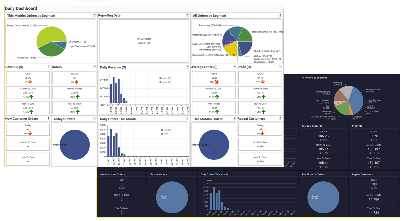
Using the small sales demo database, create and distribute a basic sales dashboard showing the following key metrics:
- Segment activity for different time periods - This Month, All Data
- Monthly revenue split by metric - Sales, Profit
- Orders split by repeat and new customers
- Daily, Month to Date and Year To Date metrics for:
- Revenue
- Profit
- Order
- Average Order Amount
The dashboard contains the following individual reports that are generated using profiles, multi-function profiles and panel forms:
- This Month’s Orders by Segment: pie chart showing orders for the month grouped by customer segment. Each number represents the number of orders this month for customers in a particular segment.
- Reporting Date: the date of the last order in the sales data
- All Orders By Segment: pie chart showing total orders grouped by customer segment. Each number represents the number of orders made by customers who are currently in each segment.
- Daily Revenue ($):daily revenue for the current month broken out by sales metric 1 (revenue) and sales metric 2 (profit)
- Various metrics broken out by
- Current Day (with comparison to a week ago)
- Month To Date (with comparison to same Month To Date for previous year)
- Year To Date, (with comparison to same Year To Date for previous year
- The following metrics are calculated:
- Revenue ($): sum of sales
- Orders: number of orders
- Average Order: value of average order for specified time-period
- Profit (%): sum of profit
- New Customer Orders: Orders placed by new customers
- Today’s Orders: pie chart showing today’s orders broken out by customer type (new/repeat)
- Daily Orders This Month: daily order for the current month, broken out by new and repeat customers.
- This Month’s Orders: pie chart showing this month’s orders broken out by customer type (new/repeat)
- Repeat Customer Orders: orders placed by repeat customers