NOTE
This article is part of the "Tutorial - Basic Sales Dashboard" series. It assumes the following:
All reporting metrics have been created. If this has not yet been done, see Step 4b - Prepare Data for Reporting - Create Reporting Dimensions & Metrics
A blank dashboard has been created. If this has not yet been done, see Step 5 - Create Dashboard
Approach
Dashboard are made up of individual reporting elements or visualisations. This section shows how to create some of those individual components, including basic time-series plots (i.e., plots showing how various metrics change over time)
At the end of this step, you will know how to:
Create visualisations showing sales orders grouped by customer segment
Create a day by day visualisation of sales and profit for the current month to date
Add visualisations to Dashboards
Key Techniques
The following functional areas are introduced by this step:
Time-Series Plots
InsertDates
FormatDates
Video Overview
Creating Reports
The dashboard being created provides a snapshot of daily sales activity for a fictional retail client. This snapshot uses the segmentation framework that has already been created in earlier steps, along with the time-period metrics of Today, Month To Date and Year To Date.
The dashboard contains the following reports that are generated using profiles, multi-function profiles and panel forms:
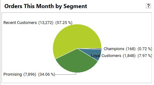
This Month’s Orders by Segment: pie chart showing orders for the month grouped by customer segment. Each number represents the number of orders this month for customers in a particular segment.
Reporting Date: the date of the last order in the sales data
All Orders By Segment: pie chart showing total orders grouped by customer segment. Each number represents the number of orders made by customers who are currently in each segment.
Daily Revenue ($):daily revenue for the current month broken out by sales metric 1 (revenue) and sales metric 2 (profit)
Various metrics broken out by
Current Day (with comparison to a week ago)
Month To Date (with comparison to same Month To Date for previous year)
Year To Date, (with comparison to same Year To Date for previous year
The following metrics are calculated:
Revenue ($): sum of sales
Orders: number of orders
Average Order: value of average order for specified time-period
Profit (%): sum of profit
New Customer Orders: Orders placed by new customers
Today’s Orders: pie chart showing today’s orders broken out by customer type (new/repeat)
Daily Orders This Month: daily order for the current month, broken out by new and repeat customers.
This Month’s Orders: pie chart showing this month’s orders broken out by customer type (new/repeat)
Repeat Customer Orders: orders placed by repeat customers

This section shows how to create and save the following reports:
This Month’s Orders by Segment: pie chart showing orders for the month grouped by customer segment. Each number represents the number of orders this month for customers in a particular segment.
All Orders By Segment: pie chart showing total orders grouped by customer segment. Each number represents the number of orders made by customers who are currently in each segment.
Daily Revenue ($):daily revenue for the current month broken out by sales metric 1 (revenue) and sales metric 2 (profit)
Daily Orders This Month: daily order for the current month, broken out by new and repeat customers.
Saving Individual Reports
Although it is possible, it is not required to save individual reports - adding the report to the dashboard and saving the dashboard will save all necessary information to recreate the individual report.
REPORT: This Month’s Orders by Segment
This section of the dashboard gives an instant visual of purchases made by different customer segments this month. Here we can see that customers in 4 of our segments have made purchases this month:
The approach to creating “This Month’s Orders by Segment” is as follows:
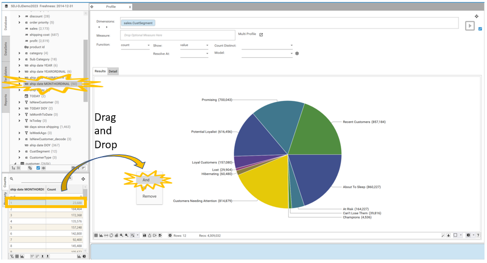
Create a profile of [sales.CustSegment] as a pie chart
Filter profile by [sales.ship date MONTHORDINAL]=1
Video Tutorial
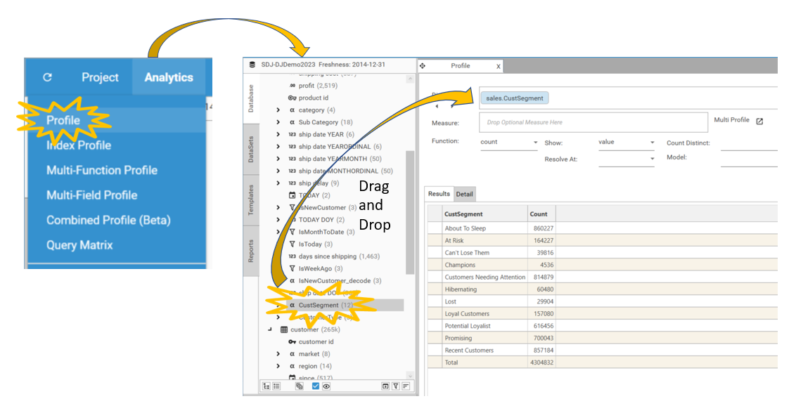
Creating a Profile of [sales.CustSegment]
Create a profile of [sales.CustSegment] by:
Selecting Analytics | Profile. The profile report will open.
Drag and drop [sales.CustSegment] information into the Dimensions box. The profile will automatically calculate.
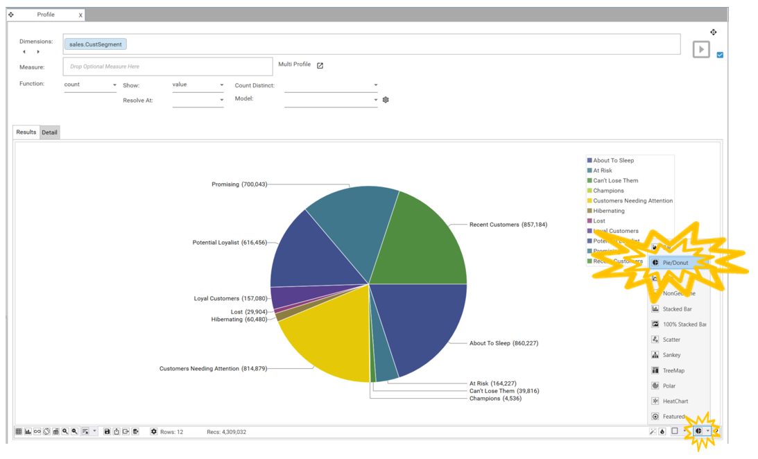
Changing profile to a pie chart
To display the data as a pie chart:
Select the Chart Type icon in the bottom right-hand corner of the micro-toolbar. The chart-type selector will open.
Select Pie/Donut. (Note: switch between pie → donut by clicking the same icon again)
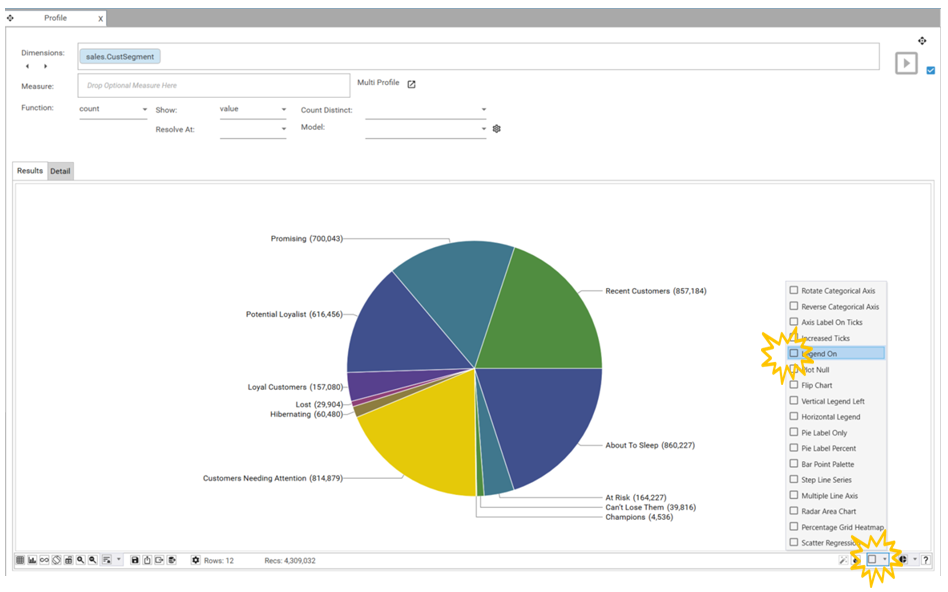
Configuring the visualisation
For this chart the legend is not required as the segments are already labelled. To turn off the legend click on the Configure Chart icon and deselect Legend On.
Filter by ship date MONTHORDINAL 1

REPORT: All Orders By Segment
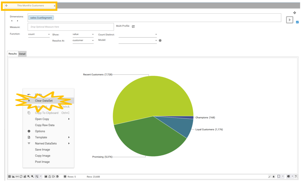
This report can be created using a shortcut. By simply clearing the filter from the This Month’s Orders by Segment report that was just created, the profile will revert to showing orders for all transactions.

Video Tutorial
Open Copy of This Month's Orders by Segment
To create a second copy of the report, do one of the following:
Go to the Reports tab in Project Explorer, select This Month’s Orders by Segment and chose “open”
If This Month’s Orders by Segment is still open, right click on the report tab and select “duplicate”
Make the following changes to the report copy:
Right-click on the pie chart and select Clear DataSet.
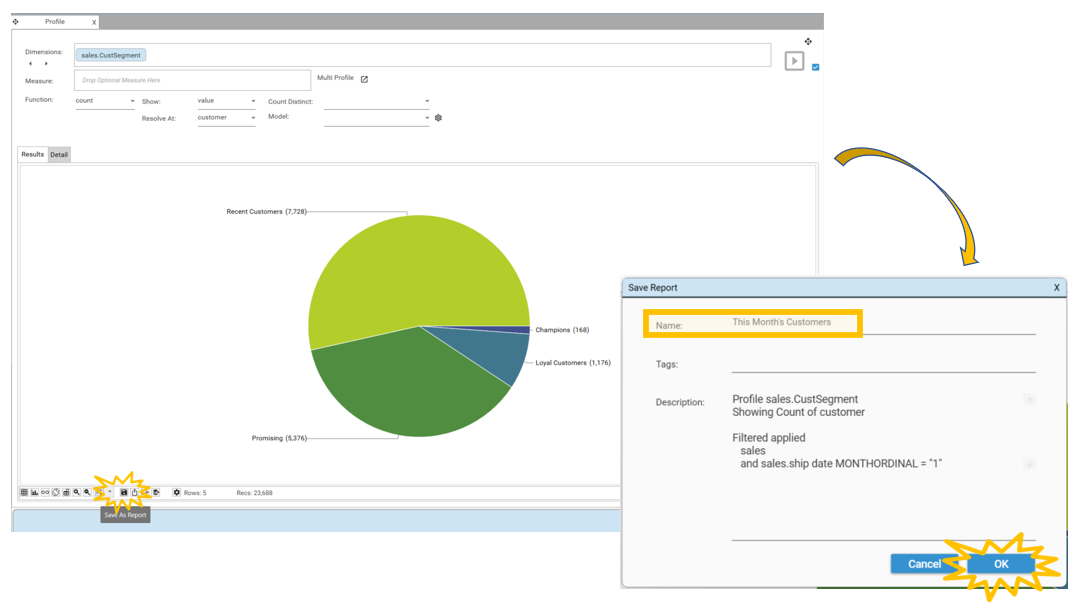
Click the save icon on the toolbar. The Save Report dialog will appear.
Change the name of the report to All Orders by Segment and select OK.
The report will appear in the Reports tab of project explorer.
REPORT: Daily Revenue ($)
The Daily Revenue report is the most complex visualisation included in the sales dashboard, and shows how to use some of the more advanced reporting features. Whilst it is based on a simple profile - created in just a couple of steps - some additional steps have been taken to give a consistent look and feel to the report regardless of when in the month the dashboard is generated.

The approach that is used to create the Daily Revenue ($) report is:
Multi-function profile: Create a multi-function profile with [sales.ship date] as the dimension and [sum of sales.sales] and [sum of sales.profit] as the measure s
Filter: Apply a dataset of [sales.ship date MONTHORDINAL]=1 as a filter
Configure Visualisation: Change display details to show a mix of line and bar chart
Post-processing, InsertDates: Force graph to always display a full month of data, regardless of the current date
Post-processing, FormatDate: Change date format to better suit dashboard layout
Video Tutorial
Create Multi-Function Profile
To create a Multi-Function Profile showing totals for sales and profits:
Select Analytics | Multi-Function Profile. The multi-function profile report will open.
Drag and drop sales.ship date into the Dimensions box.
Drag and drop sales.sales into the Measure box and select Sum.
Drag and drop sales.profit into the Measure box and select Sum.
In the setup grid, Double-click on the name headers and change the names of the measures to sales ($) and profit ($).
Click on the Green Play Button next to the Dimensions box and the Profile will be created.

Configure Visualisation
Select the Grid and Chart button to view the chart for the Profile. Because data for all transactions is being plotted, the graph will be very busy!

This Month’s Daily Revenue
To change the profile to show data for the current month only:
Select [sales.ship date MONTHORDINAL] in the project explorer
Drag and drop 1 onto the result grid and select And.

To change which type of graph is selected for sales and profit go to the Setup tab:
On the sales row change the Series Type to Bar.
On the profit row change the Series Type to Line.
Press the Green Play Button again to recreate the Profile.

The charts may not automatically update in which case change the graph to a Bar chart and then recalculate.

Post Processing
The data for this month only has seven days (TODAY’s date in the demo dataset is Jan 7th), but regardless of which day of the month it is, we want the Daily Revenue chart to show days for the entire month on the X axis.
To fix the number of values on the X axis:
Click the post-processing configure icon. The Profile Post Processing dialog will open.
Select New | InsertDates. The InsertDates configuration screen will display.

To configure the InsertDates process:
Set the Column to ship date by right-clicking in the column box and selecting ship date
Set the Start of Month to Y, End of Month to Y,
Set Required Range to 31 and interval to Days
Select Apply
Select Update Source and close the dialog.
Press the play button to recalculate the profile.

Configuring Chart Axis
Now that a whole month’s worth of data is on the X Axis, there is only space to display some of the labels. We can display all the labels by rotating the axis labels so that they are vertical rather than horizontal.
To rotate the labels:
Click the Configure Chart button on the toolbar.
Select Rotate Categorical Axis.

Now that the labels are visible, the format of the Date Column is ready to be changed to the MMM-dd format. To do this:
Select the Post-Processing Configure icon. The Profile Post Processing dialog will open.
Select New | FormatDateColumn. The FormatDate configuration screen will display.
Right click in Column and choose ship date.
Change the Format to MMM-dd.
Select Apply
Select Update Source.
Press the play button to recalculate the profile.
Set the view type to be “chart-only”

Save Report
To save the report:
Select the Save button
Rename the report Daily Revenue ($)
Select OK
REPORT: Orders This Month
Note the steps for this report are very similar to the steps for Daily Revenue ($). In addition to the techniques shown for the Daily Revenue report, this report shows how to:
duplicate measures
apply row level filters to individual measures

Video Tutorial
Create Multi-Function Profile
To create a Multi-Function Profile go to Analytics | Multi-Function Profile.
For the Daily Orders calculation:
Drag and drop sales.ship date into the Dimensions box.
Drag and drop sales.transaction id into the Measure box and select Count.
REPEAT: Right-Click on the existing measure and select “Duplicate Row”
Double-click on the name headers and change the names of the measures to Repeat and New.
Click on the Green Play Button next to the Dimensions box and the Profile will be created.


Adding Filters
At the moment both series in the chart are the same. To make one show repeat customers and one show new, we will apply row level filters to the individual measures. There are multiple ways to add filters, we will show 2 different ways below:
To filter for New customers this month:
Select ship date MONTHORDINAL and Drag and drop 1 into the Hotbar.
Select [sales.CustomerType]=New from the project explorer and Drag and drop it onto MONTHORDINAL 1 in the Hotbar.
Select AND.
Drag and drop this Dataset onto the New row.

To filter for Repeat customers this month:
Right click on [sales.CustomerType]= New and [ship date MONTHORDINAL] = 1 (the dataset that has been created) in the Hotbar and select Open Copy. This will open a copy of the dataset which can then be edited.
Right click on [sales.CustomerType]= New and select Edit Row. The Edit Row Dialog will appear.
Change the Operator to Repeat (by double clicking and typing Repeat) then select Okay.

Drag and drop this Dataset you have just created from the Open Window and drop it onto the Repeat row, using the Drag feature.

Click on the Green Play Button next to the Dimensions box and the Profile will be created.

Post Processing and formatting
Apply the same post-processing and formatting techniques to this report as to Daily Revenue ($):
InsertDates
FormatDateColumn
Rotate Categorical Axis
Set view to “chart-only”
Save report as “Daily Orders This Month”
Adding Reports to Dashboard
Video Tutorial
Open Dashboard
Once Step 5 - Create Dashboard is completed, reports can be added to the dashboard. This can be done at the end of report creation, or along the way.
To open the blank dashboard:
Go to Project Explorer Reports tab
Expand Home
Drag and Drop Daily Sales Dashboard into the workspace.

Design/View Mode
When a saved Dashboard is opened it will be in view mode. To edit the dashboard put it into design mode by one of the following methods:
Right-click and choose “design mode”
Select the Toggle button.

NOTE: To see if a dashboard is in design mode confirm that individual slots have orange borders surrounding them.
Add Reports to Dashboard
The following are all valid ways to add a report to a dashboard:
Drag from the Report tab and drop on a slot
Open the report, pick up the report by the header, hover over the dashboard and drop the report into the desired slot
Drag a field from the database tree and drop it into a slot (this will give simple visualisation options).
To add the reports created in this step you can simply drag and drop them into your dashboard.
Drag and drop This Month’s Customers in the top left-hand corner.

Drag and drop All Orders By Segment in the top right-hand corner.

Drag and drop Daily Revenue ($) in the centre slot.

Drag and drop Orders This Month in the central bottom slot.

Save Dashboard
Finally we want to save the changes made to the Dashboard. You can then save this dashboard template by clicking the save icon on the toolbar. The Save Report dialog will appear. Keep the name of the report as DAILY DASHBOARD and select OK. Select Overwrite Report and the report will update.
