Instant Insight with Profiles
- Determining the number of times a particular event or observation appears in a dataset
- Counting the number of times a value appears in a dataset
- Visualising the frequency pattern for a variable
- Comparing under and over representation of characteristics for difference audiences
- Creating bar charts, tree maps, pie charts, radar charts, scatter plots, heat maps and area charts from tables of data
- Detecting outliers and incorrect data
{TODO: Instant Insights video}
See Also
This article shows some of the instant insights that are available as soon as the data is loaded. For details on how additional visualisations can be created - perhaps as a result of engineering, scripting and modelling - see Precision Analytics.
Viewing Frequency Counts
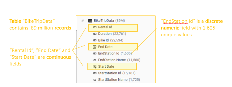
Data is stored as either CONTINUOUS or DISCRETE data:
- Discrete Field data : data with a limited number of possible values, including:
- Categorical or nominal variables with no natural order (e.g., Station Name, Model of Car, Fuel Type)
- Binary variables (0/1, Yes/No, A/B)
- Ordinal variables, similar to categorical variables, but with an order (e.g., Cylinders: 1...9)
- Interval variables : ordinal variables with equally spaced intervals (e.g., YearQuarter (20211, 20212, 20213, 20214...) )
- Date variables (e.g., Start Date)
- Continuous Field data : data with an unlimited number of possible values, including:
- DateTime variables
- ID or key fields
- Name, Address...
Discrete data display in the Database Explorer includes name and count - the count represents the number of different values for the field:
Expanding a discrete field in the Database Tree will show the number of occurrences for each different value:
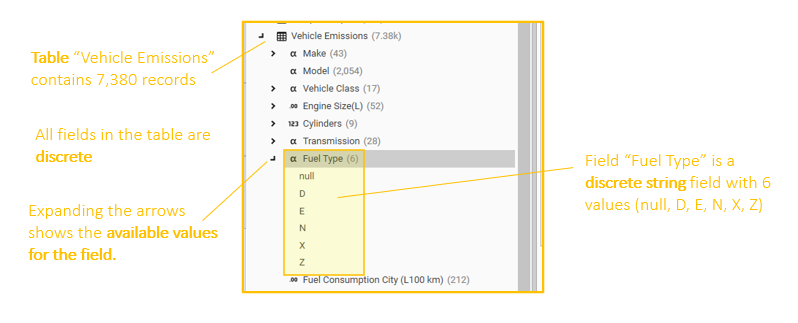
Data that has been loaded (or engineered) as Discrete can be instantly profiled (or counted) in the following ways:
- Context Panel
- Database Explorer | Field | Right-Click | Profile
- Analytics | Profile
- Analytics | Index Profile
- Analytics | Multi-Function Profile
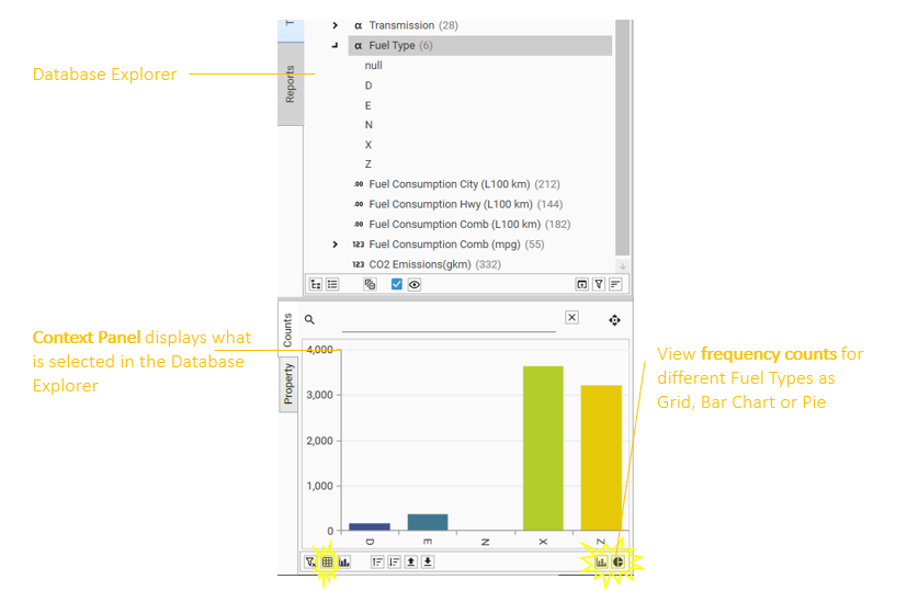
Context Panel
The Context Panel is always available for quick inspection of whatever has been selected in the Database Explorer. 2 views are available:
- Properties - summary data for the objects
- Counts - Quick Counts (or profiles) for discrete fields
{TODO: Video - working with the context panel}
Quick Counts
Select a discrete item in the Database Explorer (either in the tree-view, list-view, or category view if configured), and summary (or aggregate) counts for the different values will be instantly displayed in the context panel grid:
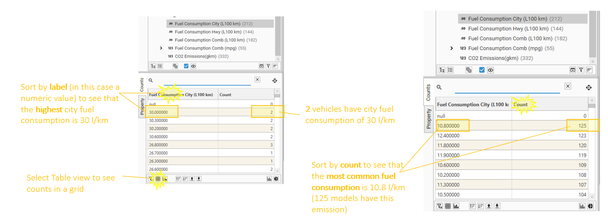
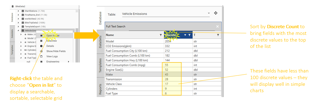
Sorting by Count, Value, Discrete Count, Field Type
The context panel grid can be sorted by value and by count, to quickly see highest and lowest values:
In the Database list view, sort fields by name, discrete count, or data type:
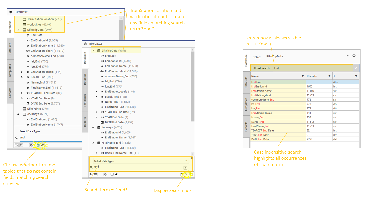
Searching and Filtering
Use search boxes in the Context Panel, List View and Tree View to find specific field names:
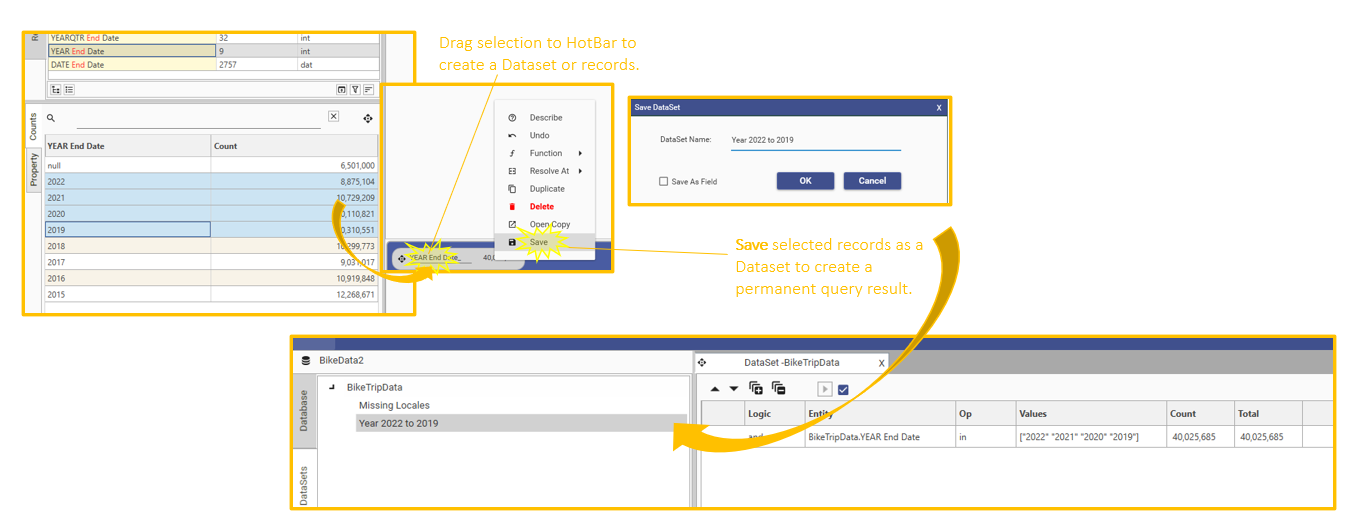
Saving Segments and Queries
Save segments or records of interest by selecting rows in the context panel, dragging them to the HotBar, right-clicking and choosing "Save":
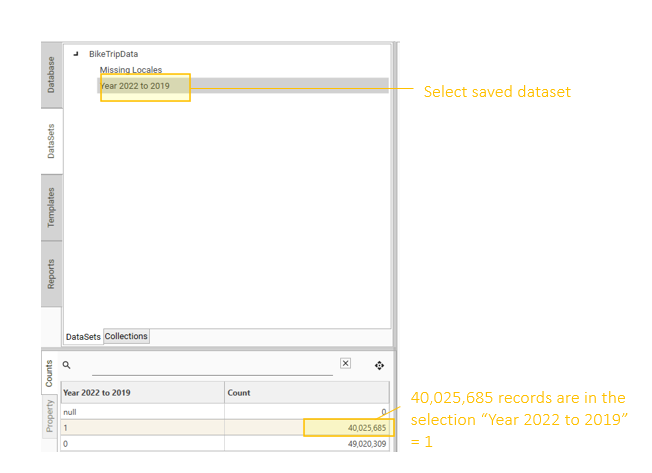
Select a saved Dataset in the Datasets tab, and context panel will display the selection counts
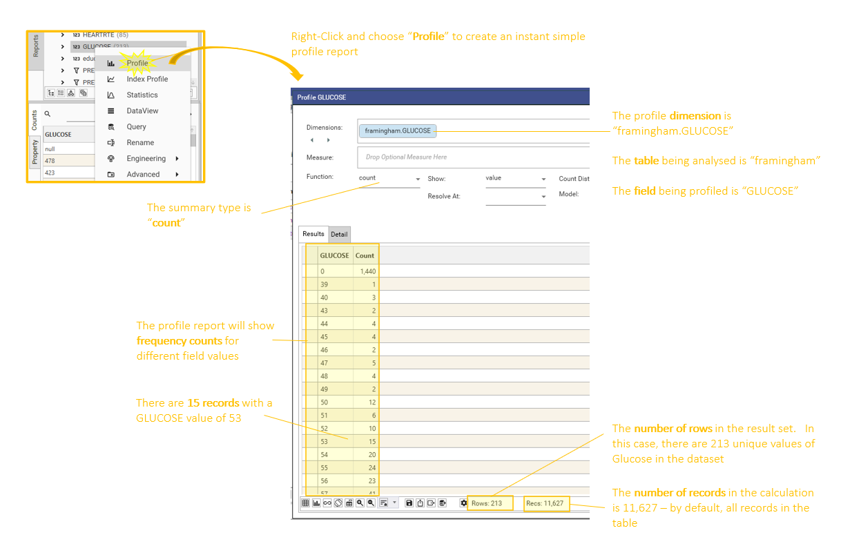
Creating a profile from the Database Explorer
The Database Explorer right-click menu gives context sensitive options for actions to take with the selected object, including creating a configurable instant profile.
Right-Click | Profile
Select a discrete field in the Database Tree or List view, right-click and choose Profile. An instant profile for the field will be created:
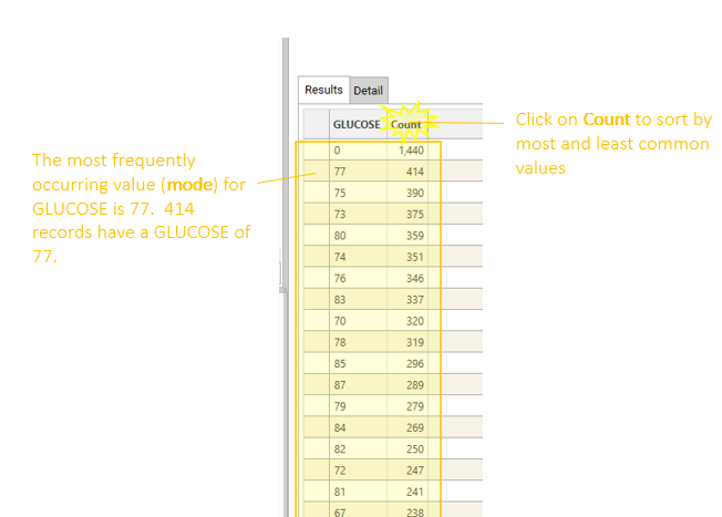
Sort Results
Sort the summary table by clicking on the column headers:
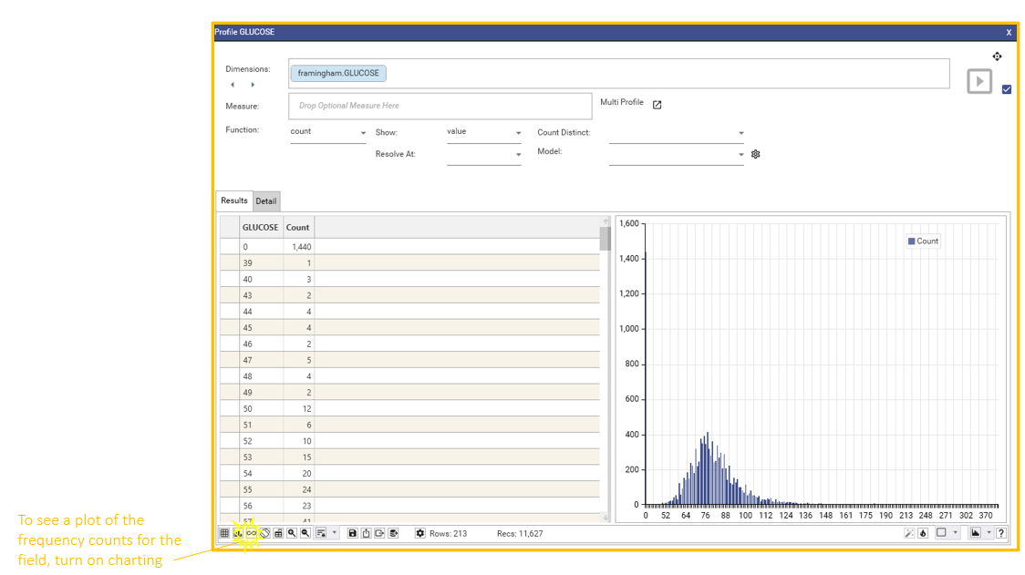
Visualise Results
View the summary data as a chart or plot by turning on visualisations:
Once a basic visualisation has been created, there are many refinements that can be made in order to fit the visualisation well to the data.
- Changing the visualisation type to "line" or "non-geo line"
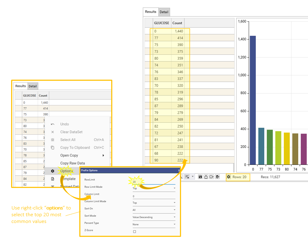
- Limiting the number of rows in the "Options" tab
Limit Rows
If there are too many rows to visualise, change the plot type, or limit the rows in the result-set:
View Intersectional Counts
Drag other fields from the Database Explorer and add to the existing profile to add more columns to the summary table: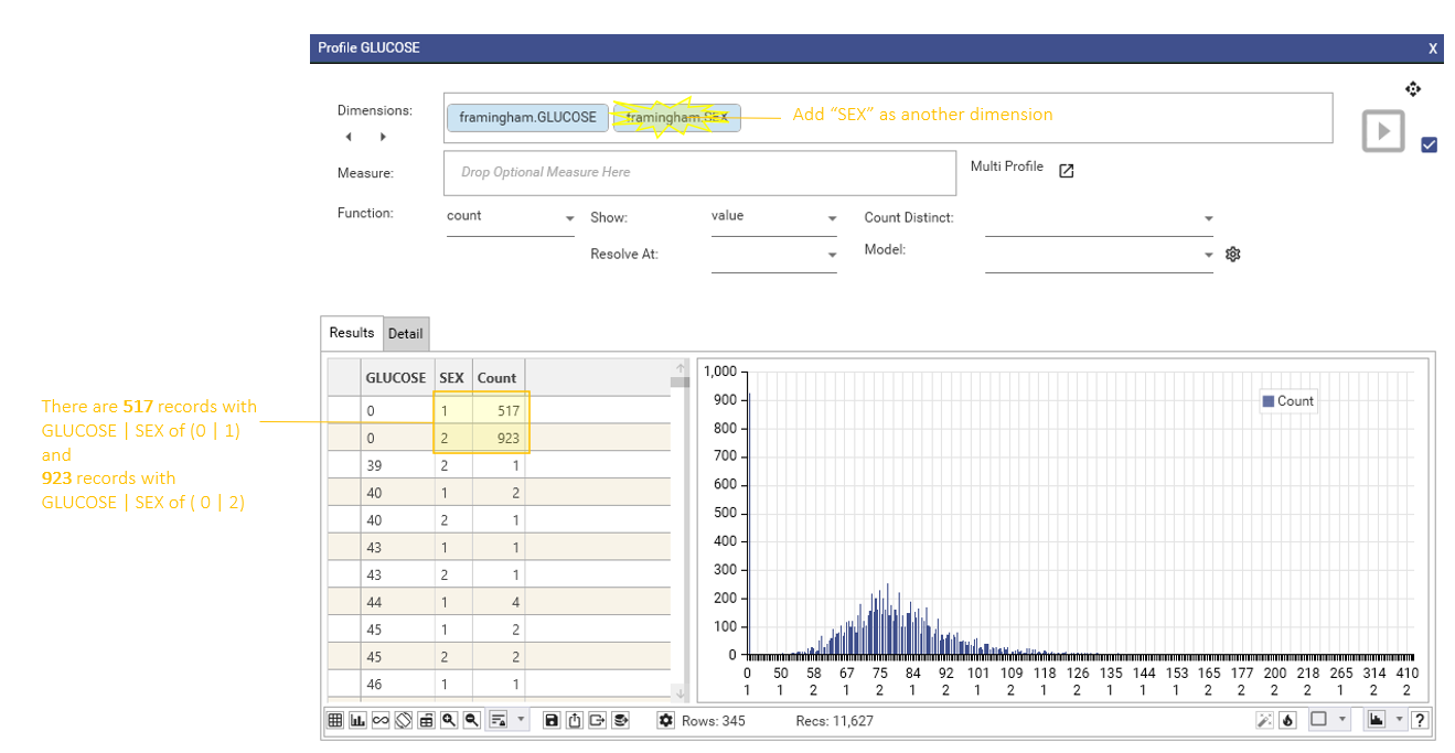
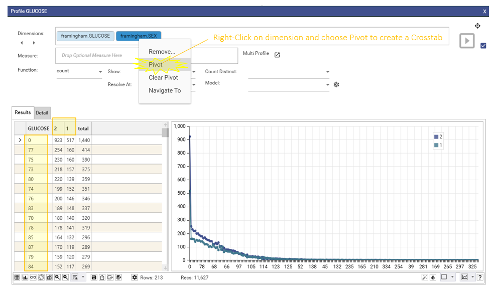
Display as Crosstab or Pivot Table
Select one of the fields, right-click and choose "Pivot" to see the table as a Crosstab or Pivot Table
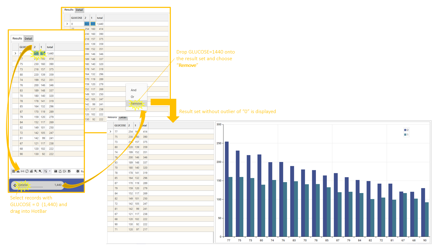
Remove Outliers
See the effect of removing outliers by:
- Selecting rows containing outliers from the grid
- Dragging to HotBar
- Dragging from HotBar and dropping on grid
- Choosing remove.
This will removes all records in the dropped dataset from the result set:
Change Chart Type and Orientation
Change Chart Type and Layout to optimise data display and highlight required features
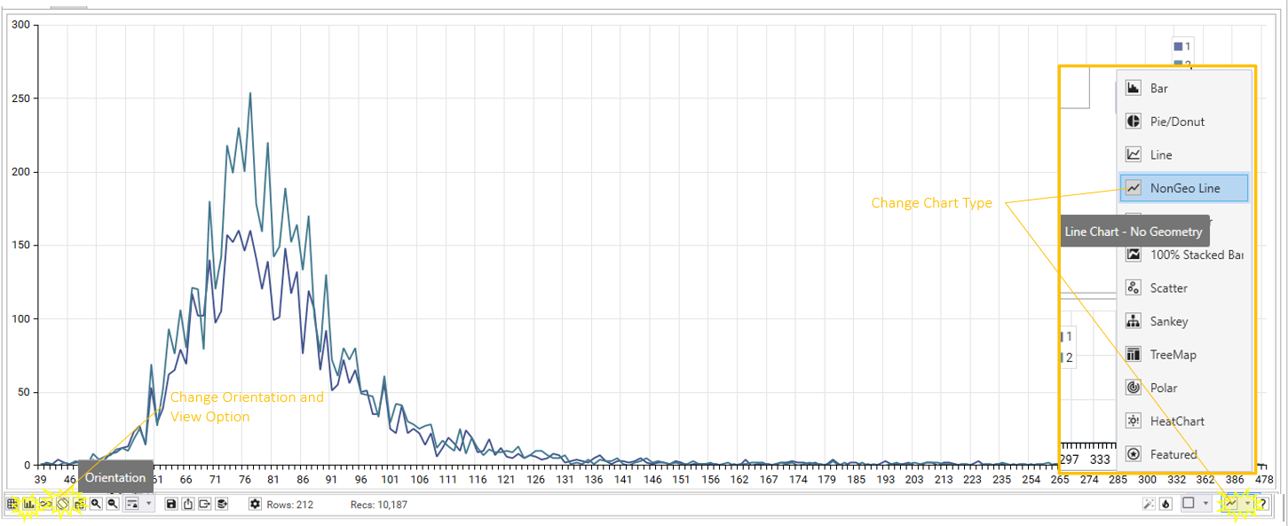
Refine Visualisations
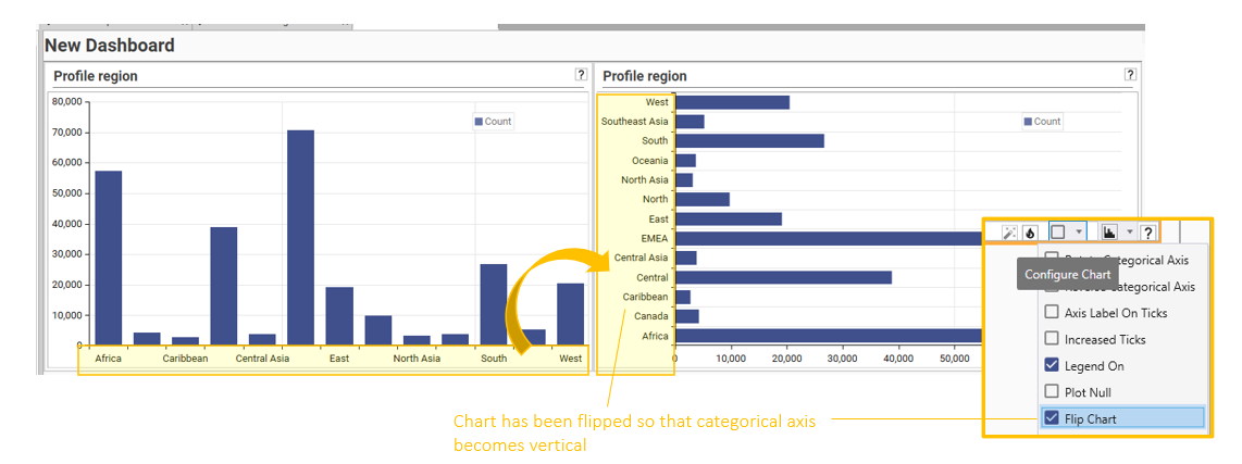
Flip the chart so that X and Y axis change place:
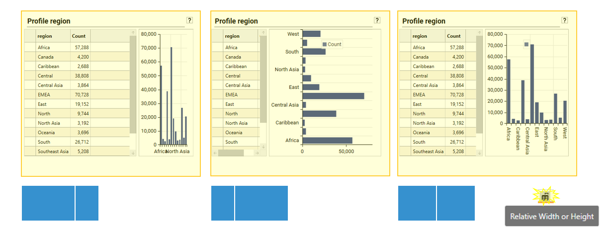
Change the layout proportions to give more or less space to grid/chart:
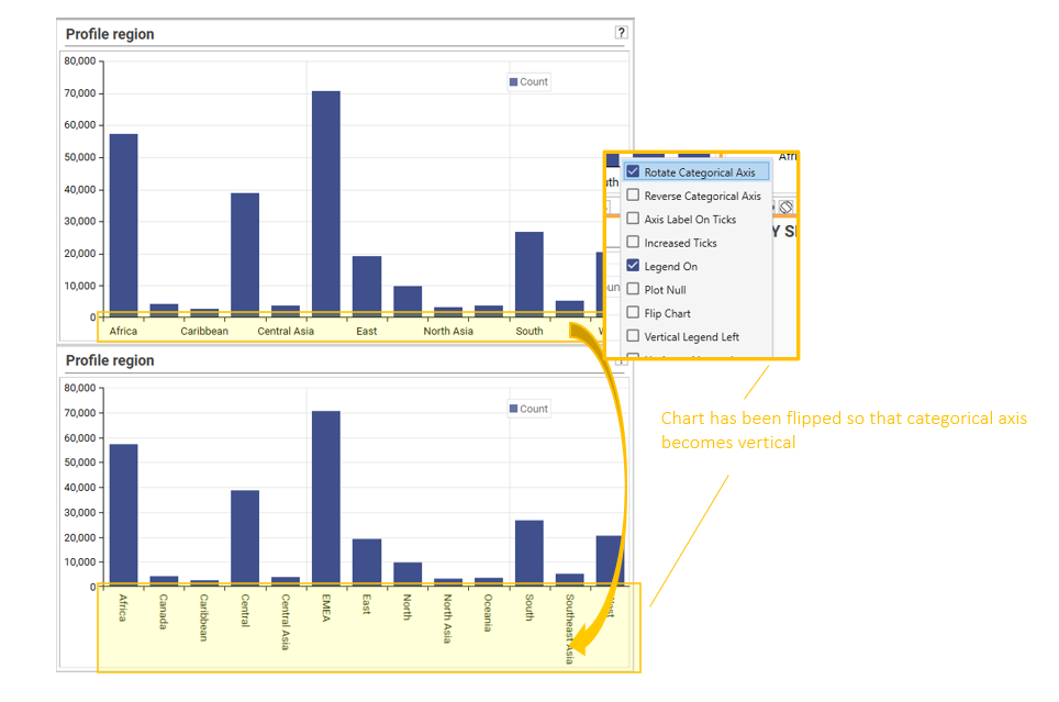
Rotate the categorical axis so that more labels are displayed, or to improve readability:
Turn on multiple colours for bar charts: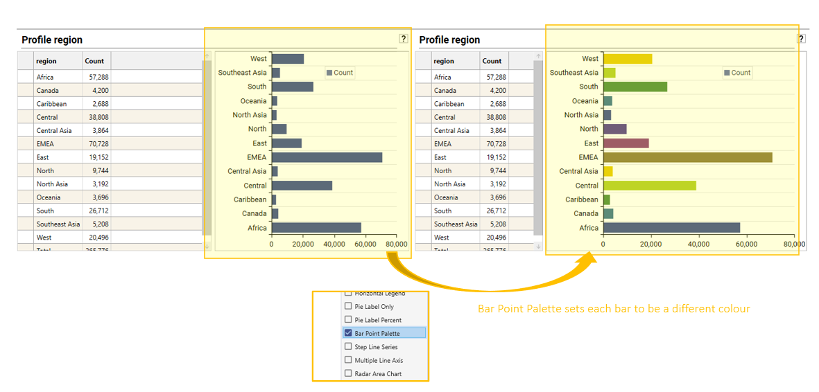
Reverse the categorical (or X) axis to flip top->bottom or left->right: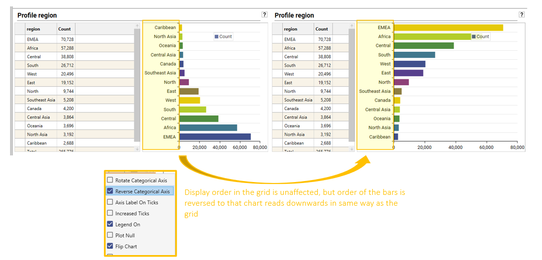
View Best/Worst/Top/Bottom counts
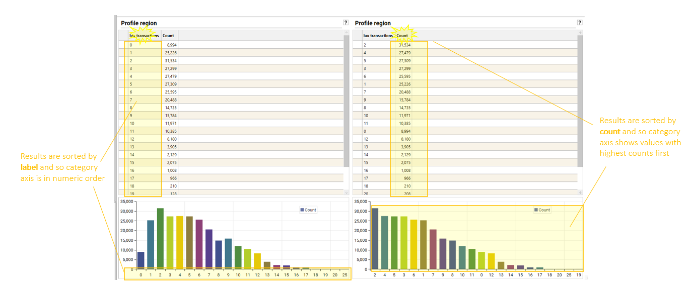
Many interactions are possible to obtain exactly the desired result set for visualisation. The simplest actions involve sorting results either by Label or Count. Both can be sorted ascending or descending:
A common requirement is to see the "Top 10" or "Bottom 10" of a distribution. There are multiple ways of achieving either.
For Top 10:
- sort by COUNT DESCENDING and then limit rows to top 10
- sort by COUNT ASCENDING and limit rows to bottom 10
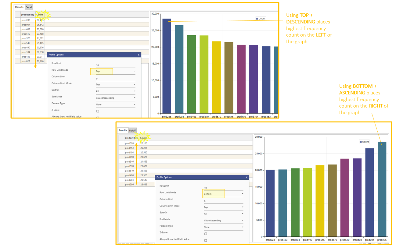
For bottom 10,
- sort by COUNT ASCENDING and then limit rows to top 10
- sort by COUNT DESCENDING and limit rows to bottom 10
Common Chart Types
| Chart Type | Description | How to Create |
|---|---|---|
| Histogram | A histogram is a type of frequency graph used to display statistical or quantitative data. It shows the frequency or distribution of continuous data, like the length of store visits or the number of students involved in one or more extracurricular organizations. Histograms include data ranges grouped into data bins, or intervals, on the x-axis, with frequency counts on the y-axis. 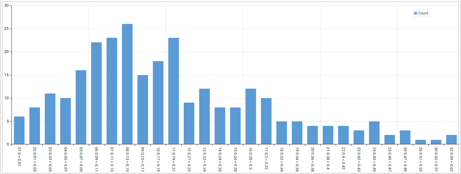 | Create histograms for continuous data by creating banded fields, either from the engineering section, or by viewing the statistics report. Banded fields can be auto-generated in the statistics report. Ordered numeric data, such as time-series data like dates, quarters etc can be plotted using the usual profile report and selecting chart-type "bar". |
| Bar Charts | Bar charts are a simple but effective way of plotting categorical data against discrete values. The heights (or widths) of the bars are in direct proportion to the values they represent. Bar charts an excellent way of comparing discrete variables at a glance.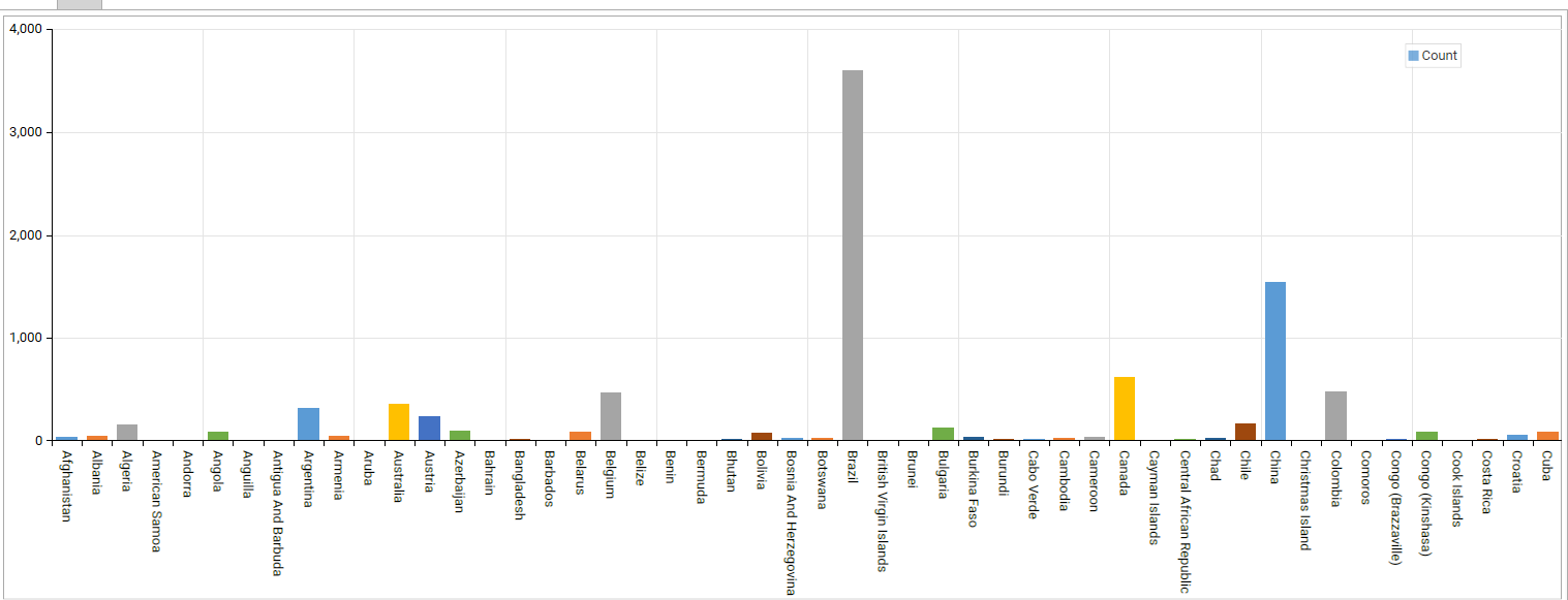 | In a profile report, use a discrete numerical or categorical value as a dimension and choose "Bar" as chart type or Right-click a field object in the Database Explorer and choose "Profile" or Drag a categorical variable with more than 10 values into a dashboard and choose "profile" |
| Clustered Bar Chart | In clustered (or grouped) bar charts, for each categorical group (or dimension) there are two or more bars color-coded to represent a particular grouping. This is useful when comparing relative counts within a group.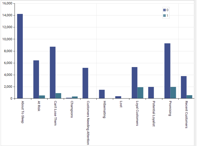 | In a profile report, add 2 discrete numerical or categorical values as dimensions and pivot one to create a crosstab. Set chart-type to "bar". |
| Stacked Bar Chart | A stacked bar chart divides each sub-group into separate sub-bars and then stacks those that belong to the same group on top of another. This is useful when needing to compare group totals whilst still having insight into the sub-groupings.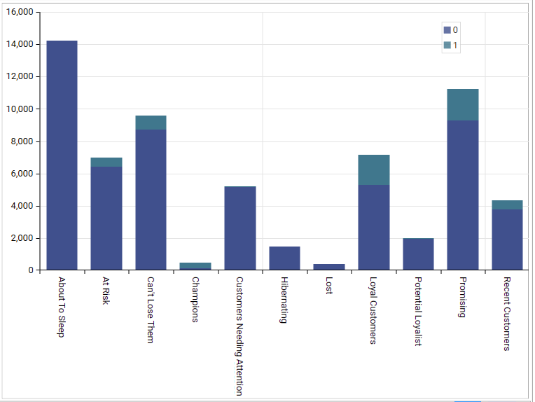 | In the Database Explorer, drop one categorical variable on top of another and choose "Crosstab". In a profile report, add 2 dimensions, and then choose chart-type "Stacked" |
| Box Blot / Whisker Plot | Boxplots are useful for visualizing a dataset’s key statistics. We can use them to represent minimum and maximum values, the median value, and the lower and upper quartiles (i.e. the median of the lower and upper halves of the data). Boxplots are what is known as ‘non-parametric.’ This means they display variation in a data sample without making any assumptions about the data’s distribution. This makes them useful for exploratory and explanatory data analysis, i.e. getting to understand a dataset’s key features before drawing any broad conclusions about it. 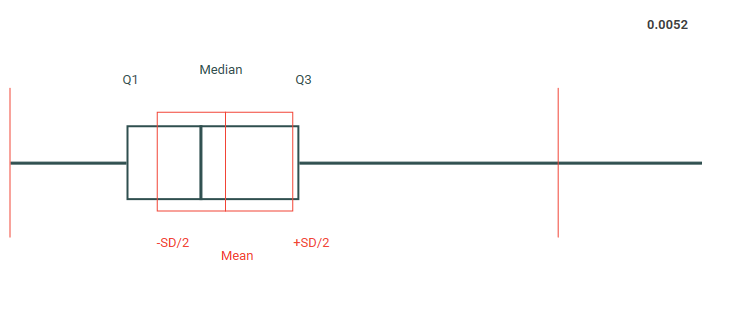 | These charts are available from the Statistics and Multi-Field Statistics reports |
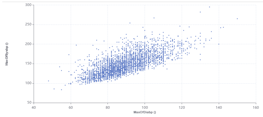
| Scatter Plots | A scatterplot displays the relationship between two variables on an x- and y-axis. Each item of data is shown as a single point, creating the chart’s visual ‘scatter’ effect. | Create a scatter plot by dropping the x-axis numeric dimension on top of the y-axis numeric dimension in the Database Explorer and choosing "scatter" |
| Line graphs | Line graphs, or line charts, are often used for representing time-series data. They are visually similar to scatterplots but represent data points separated by intervals with segments joined by a line. This allows for quick observation of features like acceleration (when the line goes up), deceleration (when the line goes down), and volatility (when the line moves up and down erratically).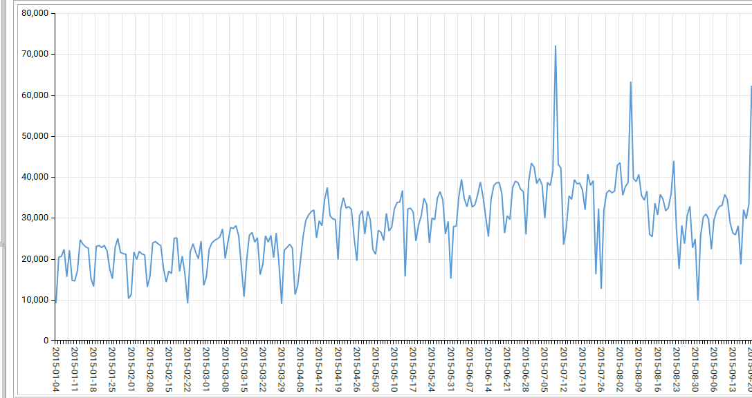 | Create a profile by selecting a numeric dimension (including a date field) in the Database Explorer, right-clicking and choosing profile. Set the chart type to "line". Tip: If there are too many values to display, add a filter or limit the number of rows. |
| Area Charts | Area charts, similar to line charts, are often used for tracking data over time. However, in an area chart, the space between the plotted line and the x-axis is shaded or colored for visibility. This is particularly useful for highlighting the difference between multiple variables, or for measuring overall volumes (rather than highlighting the difference between discrete data points). | |
| Pie Chart | Pie charts represent a single variable, broken down into percentages or proportions. Each ‘slice of the pie’ in a pie chart is proportional to the quantity it contributes to the whole, i.e. the entire circle. Pie charts are best-suited to data that is split into about five or six categories…more than that and it can be difficult to effectively represent the data: 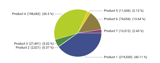 | Drag a categorical variable with less than 10 values into a dashboard and choose "profile" or Right-click a field object with less than 10 values in the Database Explorer and choose "Profile" Pie charts can also be created in the Multi-Field Profile report. |
| Radar Charts | Radar charts (also known as spider charts) are useful for representing multivariate data (i.e. data that incorporate more than one variable) in a two-dimensional format. They are commonly used to compare features between different observations. They are also helpful for identifying outliers or commonality between observations: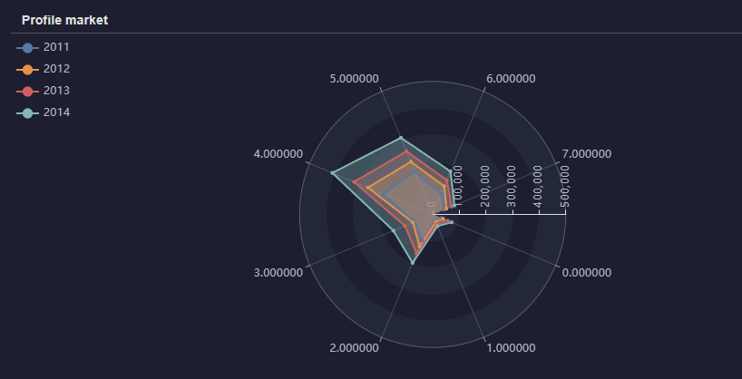 | |
| Tree Maps | Tree-maps are a type of data visualization that are used for displaying hierarchical data, usually in the form of nested rectangles. This involves breaking each category down into smaller rectangles, which represent sub-categories: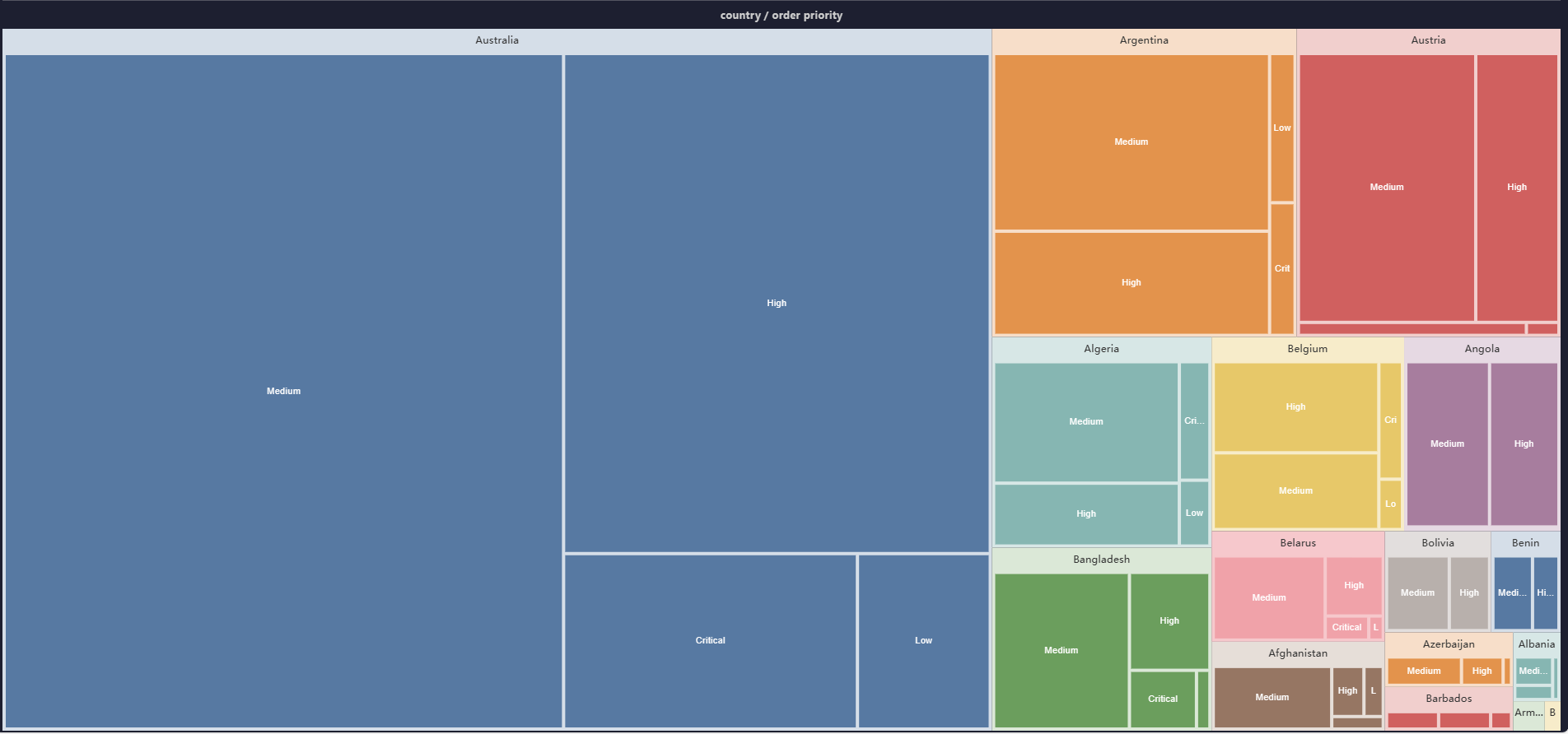 | Create a tree map by adding one or more dimensions to a profile report and choosing chart type "tree map" |
| Venn Diagram | Venn diagrams use a series of overlapping shapes (usually circles, but sometimes ellipses or other abstract forms) to highlight common features between different groups of items. Each area created by the overlapping shapes represents features that groups share in common. Where circles don’t overlap, the groups do not share features in common.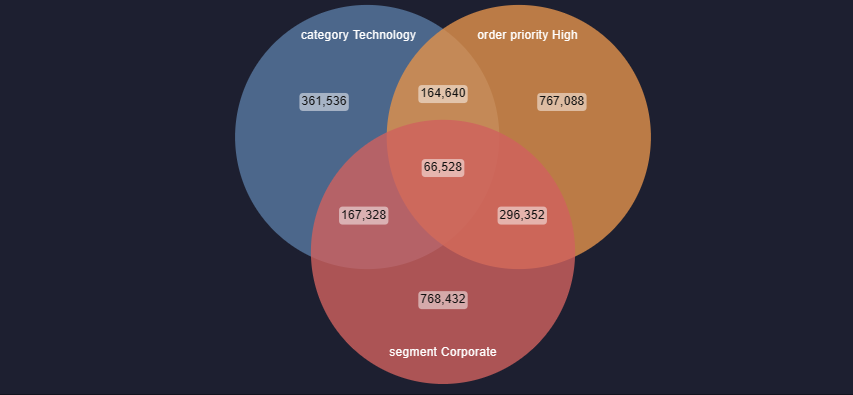 | Create a Venn diagram from Analytics | Venn |
| Funnel Chart | A funnel chart is a specialized chart type that demonstrates the flow of data (often customers) through a business or sales process. The chart takes its name from its shape, which starts from a broad head and ends in a narrow neck. The number of users at each stage of the process are indicated from the funnel’s width as it narrows.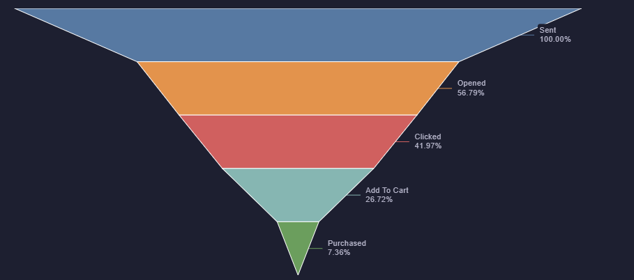 | Create a funnel chart from Analytics | Funnel |
| Index Charts | Index charts plot multiple series of information at the same time that allow a comparison to be made between relative distributions in 2 datasets for one or more dimensions. The count of each value for each dimension is plotted for dataset 1 (called the base filter) as a line, as are the counts for dataset 2 (the target filter). The ratio of the relative values is plotted as a bar chart, with bars above the index line showing vales that are over-represented in the target compared to the base, and bars under the index line showing values that are under-represented.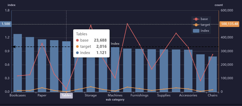 | Create an Index Profile from Analytics | Index Profile |
| Field Comparison Charts | Field comparison charts are grouped bar or pie charts, allowing segmentation for different metrics to be displayed next to each other in the same graphic: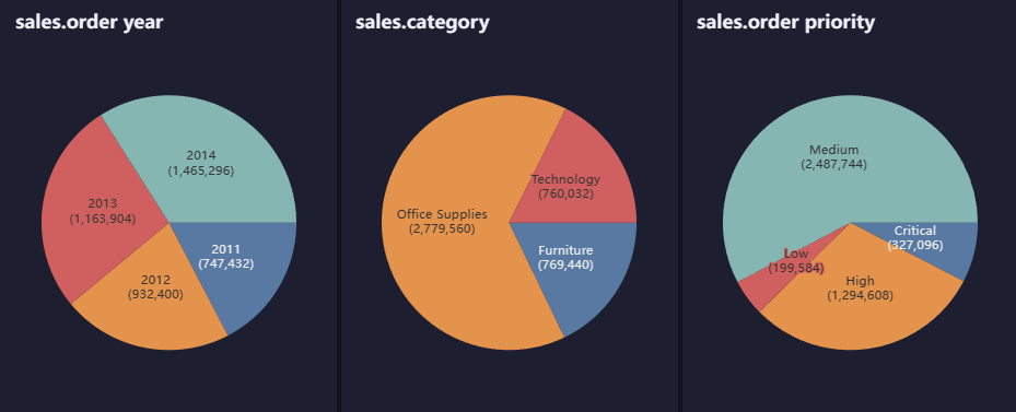 | Create a field comparison chart from Analytics | Multi-Field Profile |