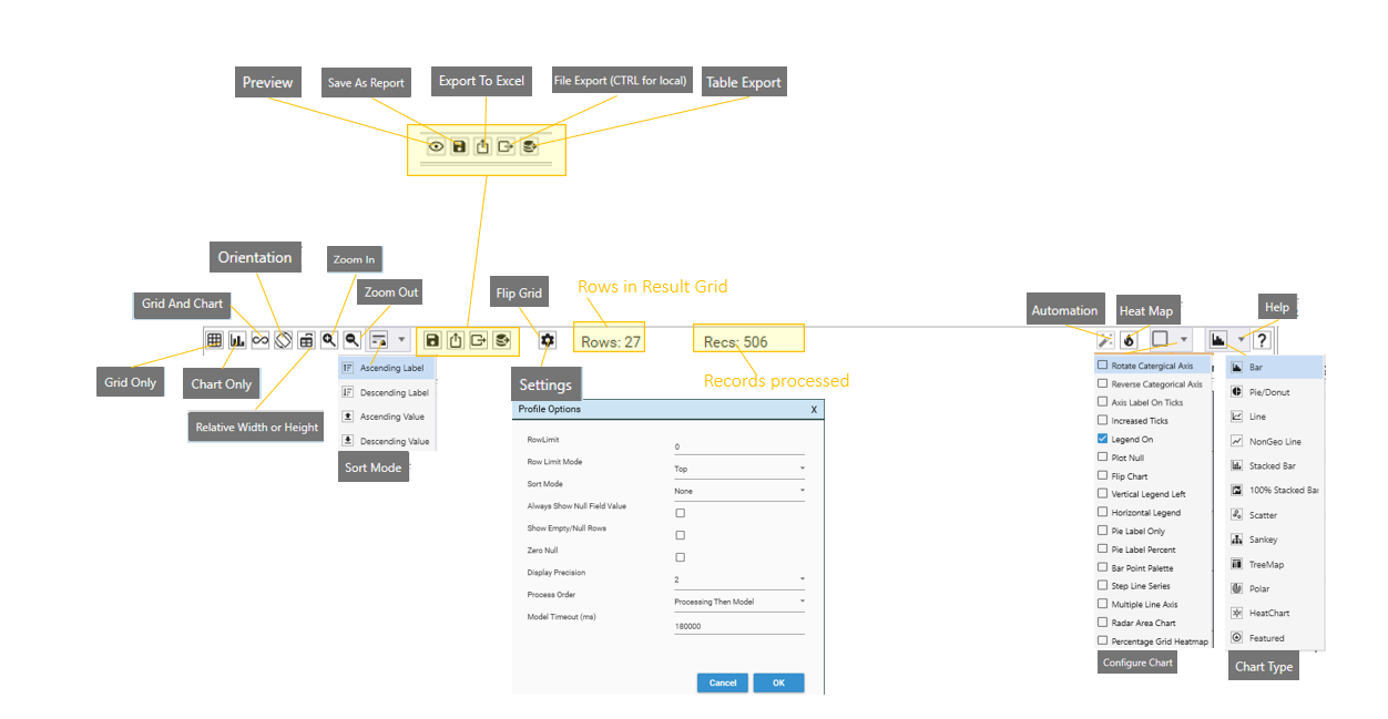
Grid Only
If selected, only a results grid will be displayed:
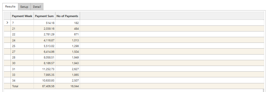
- The Profile results grid will display all rows in the calculation
- The number of rows in the calculation depends on the calculation settings and the profile dimensions.
- For single dimensions, the row limit is the same as the discrete value limit, which is 1 million.
- For multi-dimensional profiles, the number of rows in the calculation depends on the multi-dimensional result space, as worked out by the profiling engine.
- If the multi-dimensional result space exceeds 10 million rows then the profile will not calculate and the message "dspace exceeds 10 million rows" will be displayed.
Chart Only
If selected, only a chart will be displayed:
TODO: Chart Limits
Grid and Chart
If selected, both grid and chart view will be displayed.
To control the relative positions of the Grid and Chart, use the Orientation button.
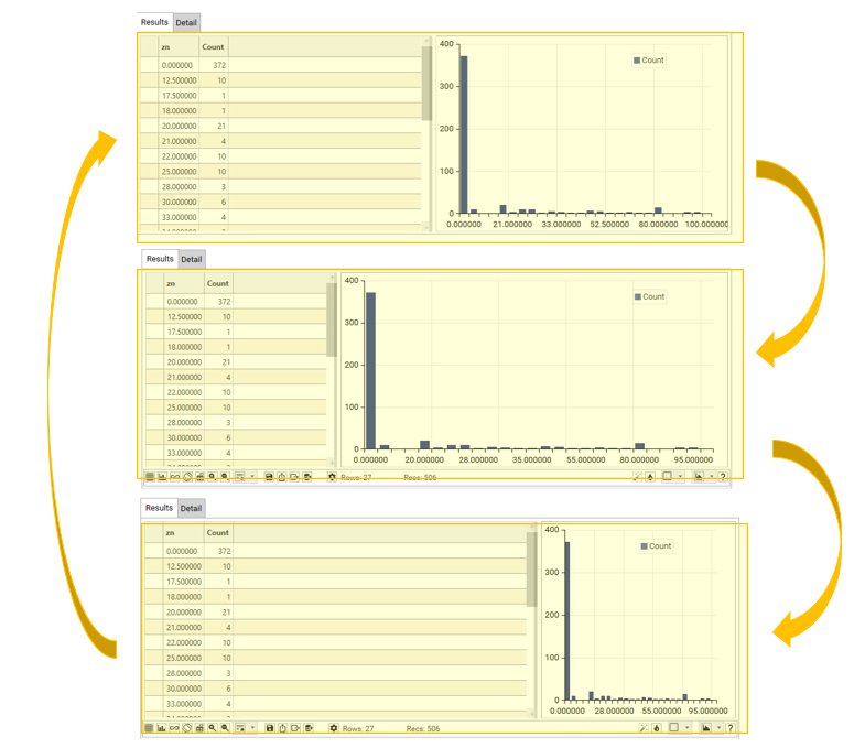
Relative Width or Height
To control the relative width of grid/chart portions of the display, iterate through options, selecting one of the following options:
- GRID: 1/3, CHART 2/3
- GRID: 1/2, CHART 1/2
- GRID: 2/3, CHART 1/3
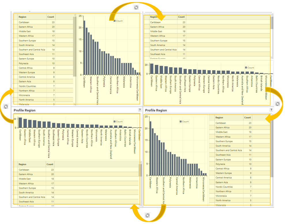
Orientation
If the profile is being displayed with a view-type of “Grid and Chart”, the Orientation button controls the positioning of the grid and chart relative to each other.
Repeated clicking of the orientation button will rotate through the available options:
Zoom In
Hides the setup area of the report and extends the display area to occupy all the workspace tab.
Zoom Out
Displays the setup area of the report and resizes the display area accordingly.
This is the default view for the report.
Sort Mode
See Profile - Options: Sort and Options: Sort Mode
Preview
Opens the active report in a web-browser.
Save as Report
Saves the profile report to the Report Tree:
Name
The name of the report – this is the name that will be displayed in the Report Tree tab and will be the workspace tab name whenever a copy of the report is opened.
Tags
Tags allow reports to be classified so that they can be easily found in the Report Tree. Each word that is specified in Tags denotes a folder in which the report will appear in the Report Tree.
Report Tree tag folders are dynamic and only folders for tags that are in use will be visible.
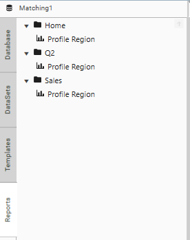
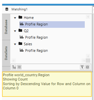
For example, the Tag list Sales Q2 will cause the saved report to be included in 2 folders:
- Sales
- Q2
The report will also be available in the Home Folder of the Report Tree:
For further information on Tags see Dashboard - Saving and Storing
Description
The text that will be displayed in the Context Panel when the report is selected in the Report Tree. This is created automatically from the report settings but can be manually over-written if desired:
Export To Excel
Exports the result grid to Excel.
If a template has been configured (using Right-click | Templates | Set) then the template will be applied.
File Export (CTRL for Local)
Exports the profile result grid to file.
If CTRL is pressed when selecting file export, a windows file dialog is opened and data can be exported to any available location.
If CTRL is not selected, a dialog with the following options will be shown:
Location
Choose from one of the following:
- My Export Folder - The current user’s export folder. Usually in
- [Install directory]/datajetsoftware/output/user/
- Team Export Folder - The system export folder. Usually in
- [Install directory]/datajetsoftware/output/
- My List Folder - The current user’s list folder. Usually in
- [Install directory]/datajetsoftware/Lists/user/
- Team list Folder - The system list folder. Usually in
- [Install directory]/datajetsoftware/Lists/
- Data Sources - The system Data Source folder. Usually in
- [Install directory]/datasources/
- Templates - The system Templates folder (i.e., the location of Excel Dashboard and Profile templates). Usually in
- [Install directory]/Templates/
Filename
The name of the file.
Upload File
If selected, the exported file will be uploaded to a Datajet FTP server, ready for download via the web.
Overwrite Existing
If selected, if the file exists already it will be overwritten.
Table Export
Exports the profile result grid to a DataJet Table.
Flip Grid (Multi-Function Profile only)
Switches the layout of the grid so that columns become rows and rows become columns. Only available in Multi-Function profile, and only available if number of columns will be less than TODO.
Settings
Displays the Options tab (see Profile - Options Dialog)
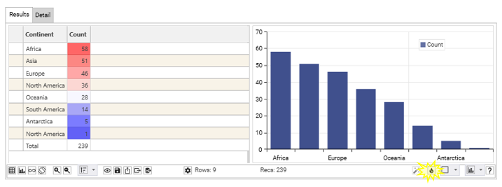
Rows
Displays the number of rows in the results grid. Includes the total row if present:
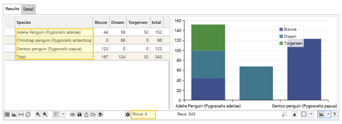
Recs
Displays the number of records being analysed. This is either the number of records in the resolution table (the table being analysed) or is the number of records in the applied dataset.
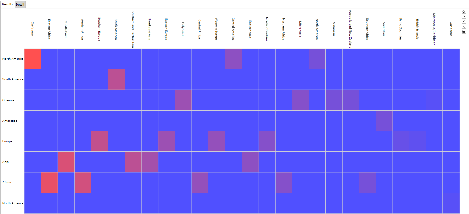
Heat Map
Toggles on and off heat mapping of the results grid – cells will be highlighted using a graduating scale that helps pick out information of note:
Configure Chart
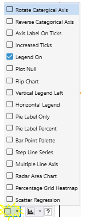
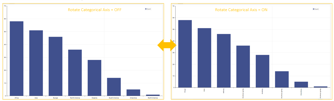
Rotate Categorical Axis
If selected, Categorical Axis labels (X-Axis, or first dimension) will be displayed perpendicular to the axis line
Ignored if bar chart is flipped to display horizontal bars.
Reverse Categorical Axis
If selected, the categorical Axis (X-axis, or first dimension) will reverse the order of values.
e.g, A B C D E -> E D C B A
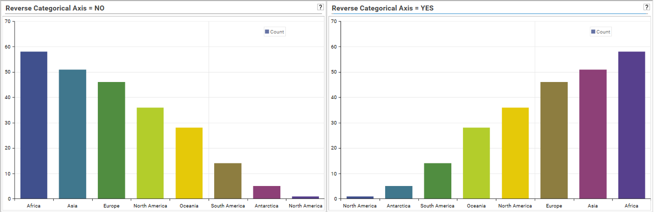 Note: Sort order and Row Limits can also be used to control display of columns and bars.
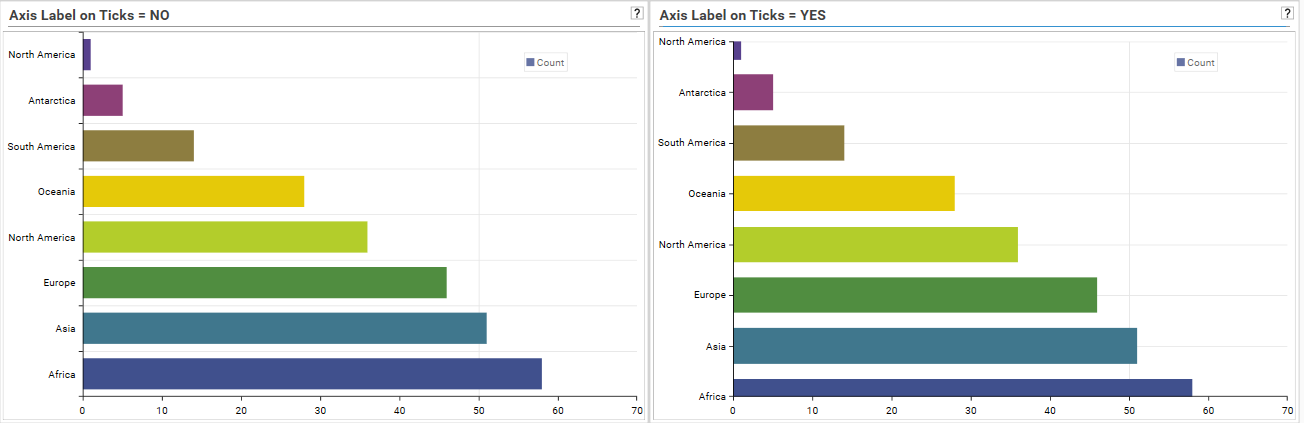
Axis Label on Ticks
Controls the position of labels relative to the axis ticks.
Legend On
Turns the legend ON/OFF for the following graph types:
- Bar
- Line/GeoLine
- Stacked Bar/Stacked Bar 100%
- Polar
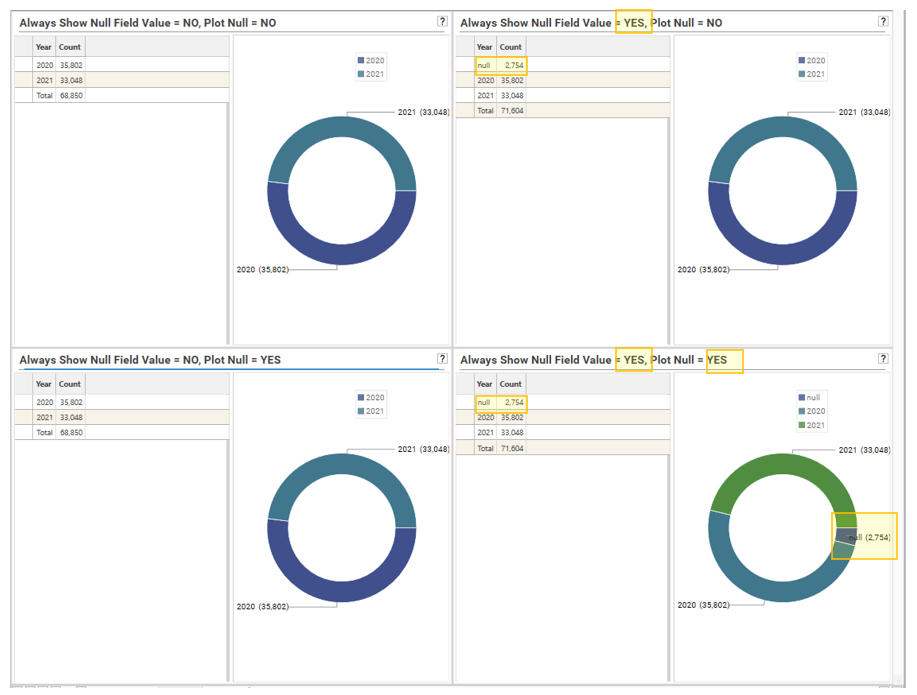
Plot Null
If selected, NULL values will be plotted, but only if the null value is displayed in the result grid.
Note: To include the null field value in the result grid, select “Always show null field value” from the options dialog.
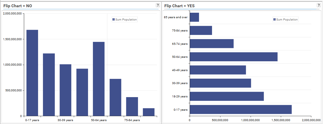
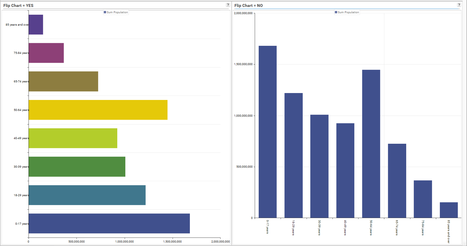
Flip Chart
If selected, places categorical axis as the vertical axis. Applies to Line charts, bar charts, stacked charts and heat charts.
Vertical Legend Left
If selected, places the vertical legend to the left of the display.
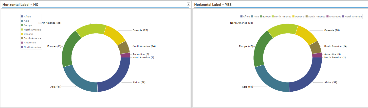
Horizontal Legend
If selected, the legend will be displayed in horizontal form. If unselected, the legend will be displayed in vertical form:
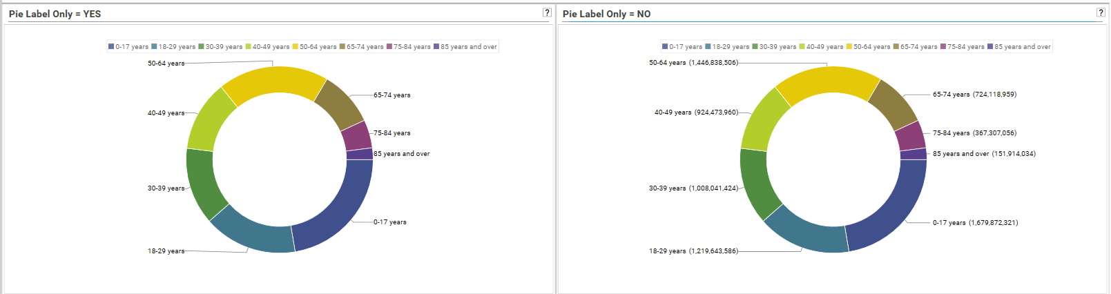
Pie Label Only
Is selected, pie charts will display just the label and no counts. If unselected, the count will be included in the label.
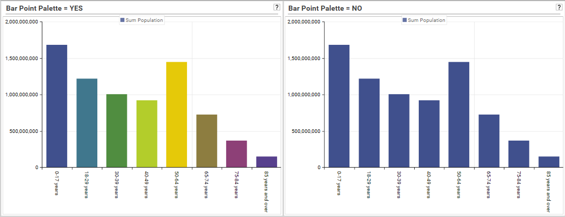
Bar Point Palette
If selected, each bar in a bar chart will be a different color:
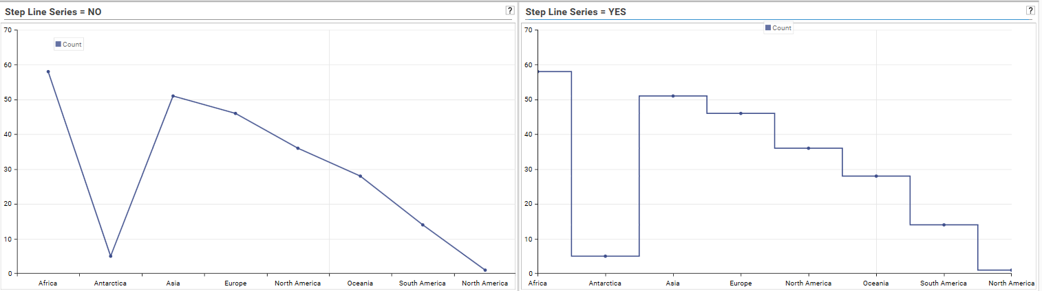
Step Line Series
If selected, displays a line where all Y-Axis changes are shown with vertical lines, as opposed to sloped lines:
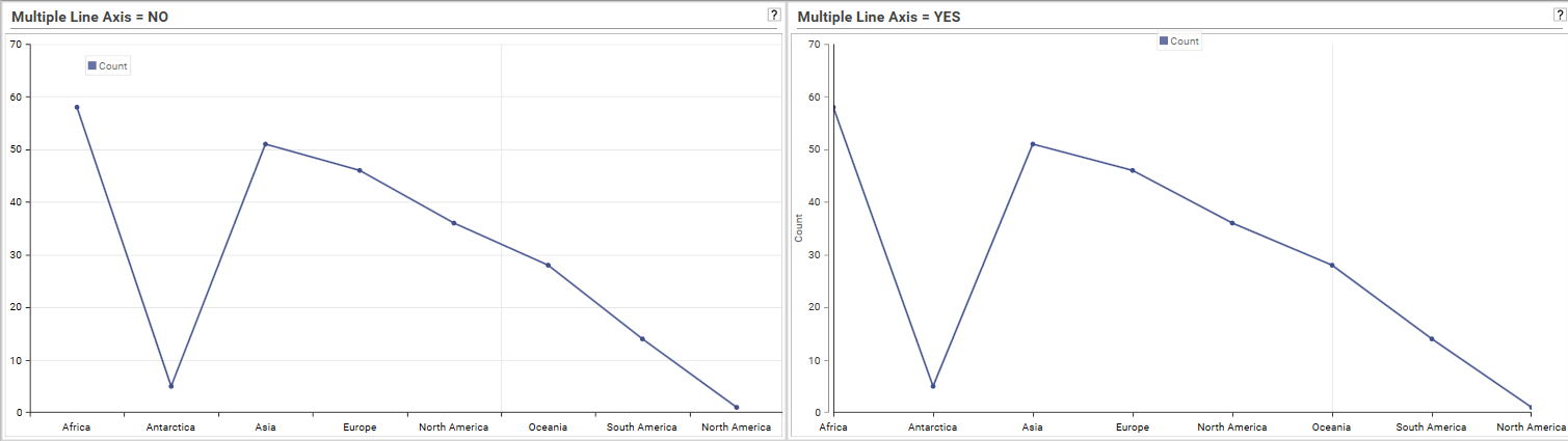
Multiple Line Axis
If selected, horizontal marker lines will be REMOVED from a line chart
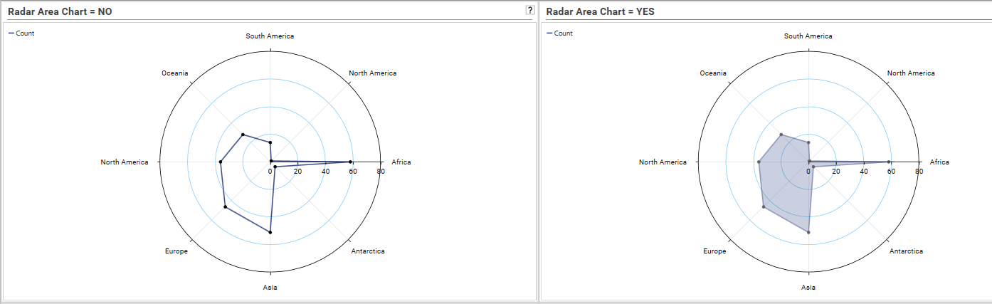
Radar Area Chart
If selected, the radar chart plot will be infilled.
Percentage Grid Heatmap
Choose Heat Map Percent if the data to be displayed is percent data, and only red colours are to be used.
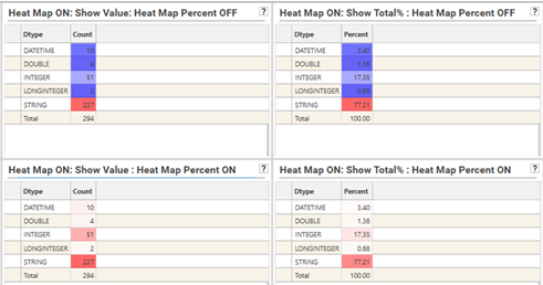
Chart Type
Note: The default chart type for a profile can be configured via right-click menu.
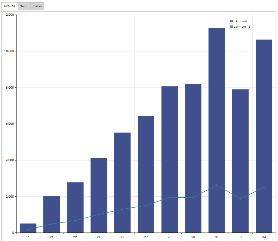
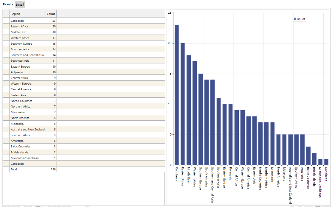
Bar
Comparison of at least one set of datapoints. Displays each group as a column.
Use Configure Chart | Flip Chart to switch between Column and Bar.
Maximum number of columns/bars that can be displayed: 32
Pie/Donut
Breakdown across a single dimension, displays proportion of data groups.
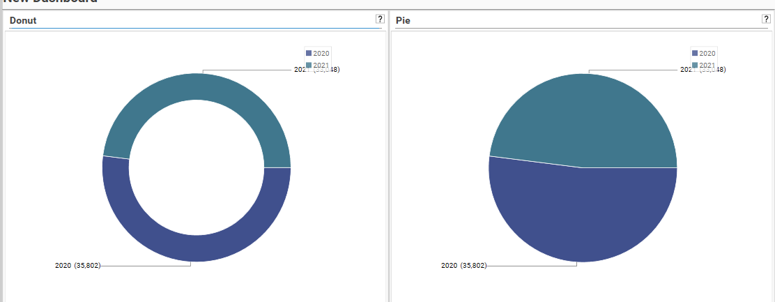
To switch between pie and donut, press the Pie/Donut option again.
If there are more than 24 discrete values in the chart, the chart will display as a line chart.
Line
Useful for visualising trends over time. This is also the default chart-type when other charts have exceeded their display limit.
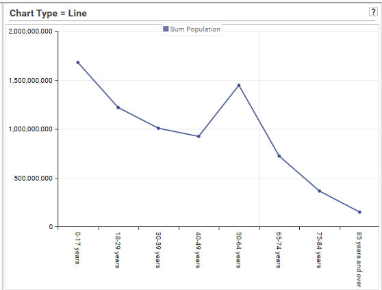
Add dimensions to add more series to the plot.
NonGeo Line
Creates a line chart with no points.
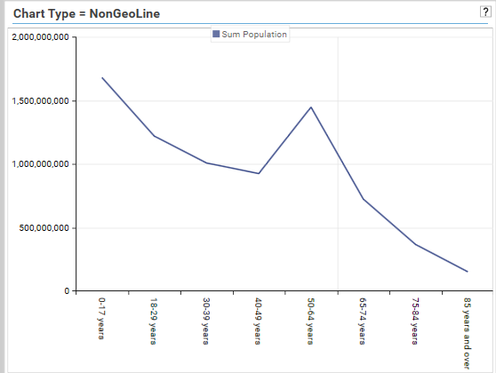
Add dimensions to add more series to the plot.
Stacked Bar
Used to display cross-tabs, and to allow comparison of components across categories.
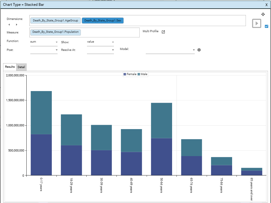
Row dimension is displayed as X Axis, Column dimension displayed as stacked segments
Use Configure Chart | Flip Chart to switch between Vertical and Horizontal bars.
Select Dimension | Right-Click | Pivot to create a crosstab. See Profile - Dimension for further details.
100% Stacked Bar
Show the relative percentage of multiple data series in stacked bars.
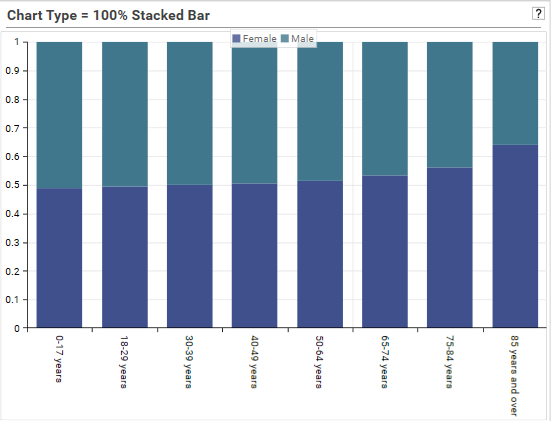 Use Configure Chart | Flip Chart to switch between Vertical and Horizontal bars
Select Dimension | Right-Click | Pivot to create a crosstab. See Profile - Dimension for further details.
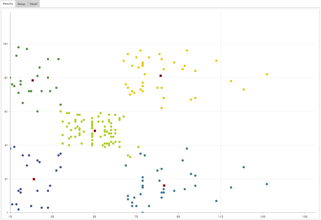
Scatter
Visualises the relationship between 2 variables. Used to determine the kind of relationship that exists between variables.
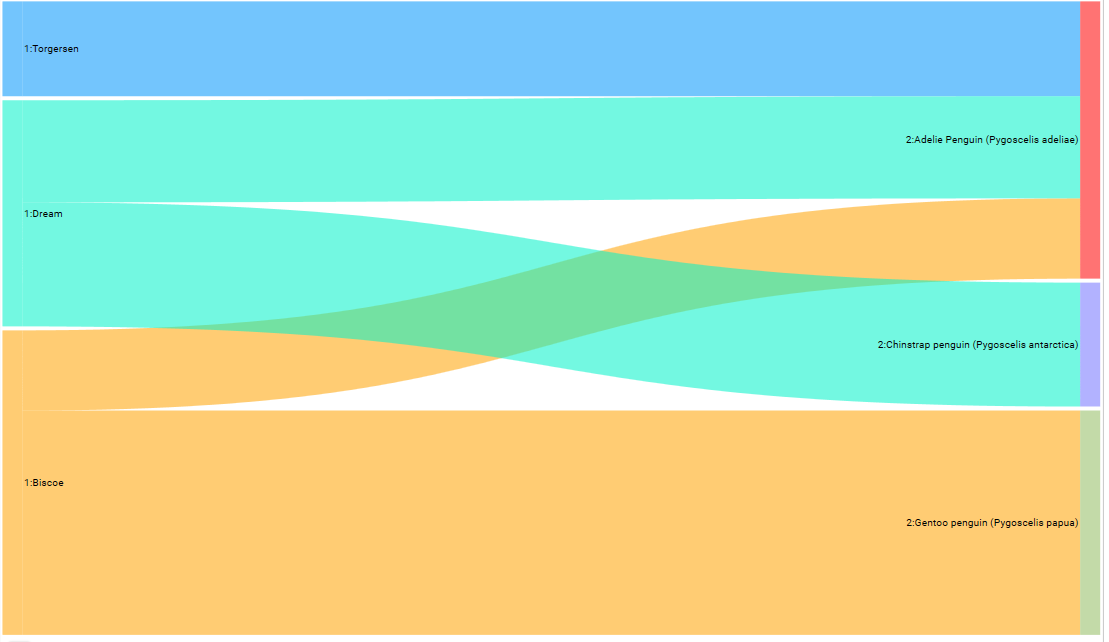
Sankey
Creates a flow diagram in which the width of the arrows represents the quantity of flow.
TreeMap
A Treemap is an arrangement of rectangles that shows the hierarchical structure of data
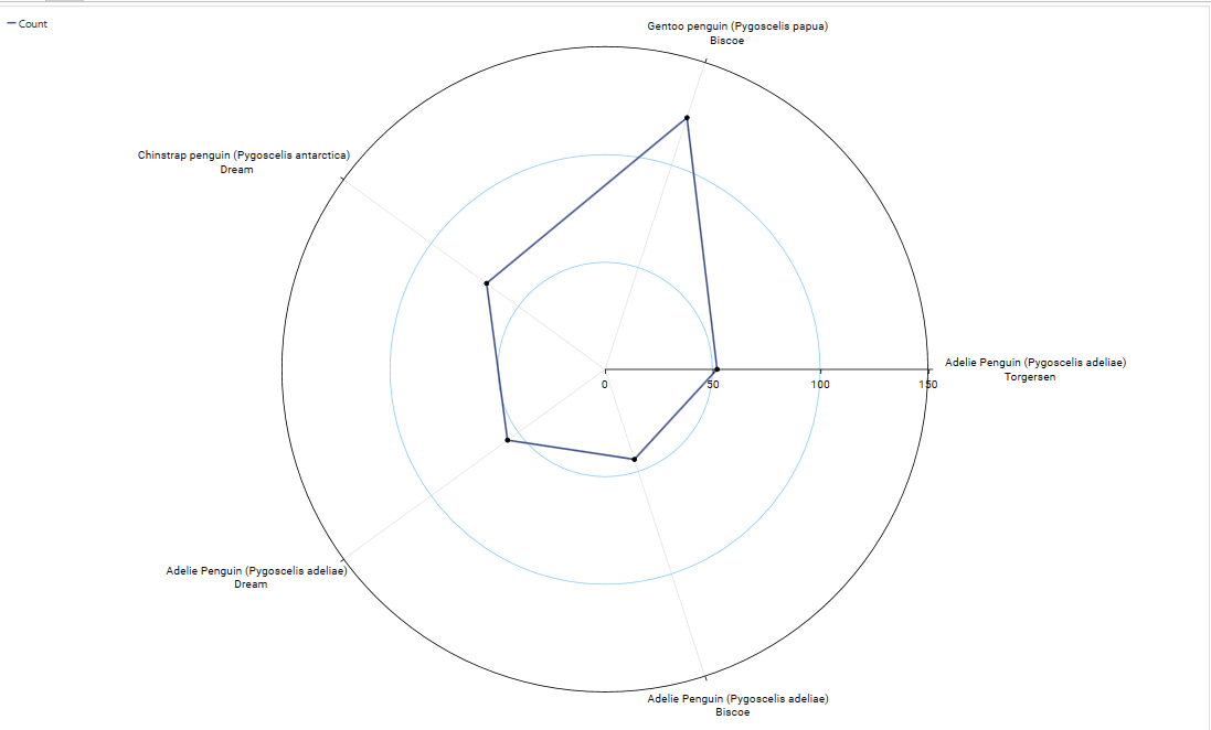
Polar/Radar
A circular graph, useful when relationships between data points can be visualized most easily in terms of radiuses and angles
HeatChart
A heat map chart is a specialized chart that uses colors to represent data values in a table. It is particularly useful when plotting large and complex data.
Featured
Featured charts provide some alternative display options that are valid for a limited number of cases:
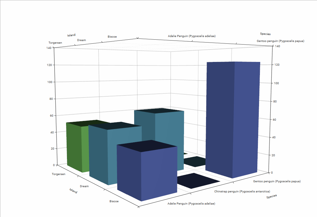
If a cross-tab has less than 64 by 64 dimensions, it shows a 3-d chart:
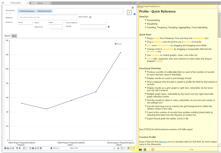
Help
Clicking the help icon will open up the Info Panel, with the inline help for the Profile report: