Overview
Accessed via Main Menu - Analytics - Multi Field profile.
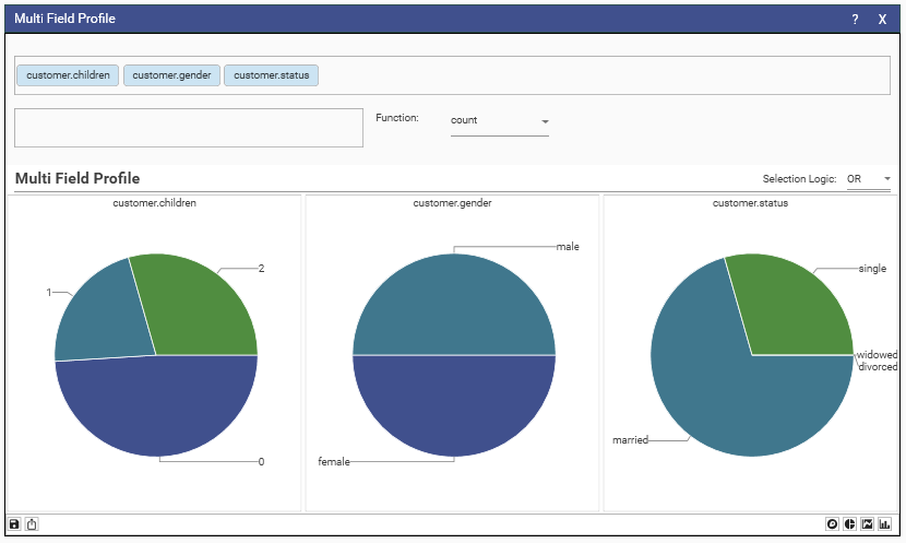
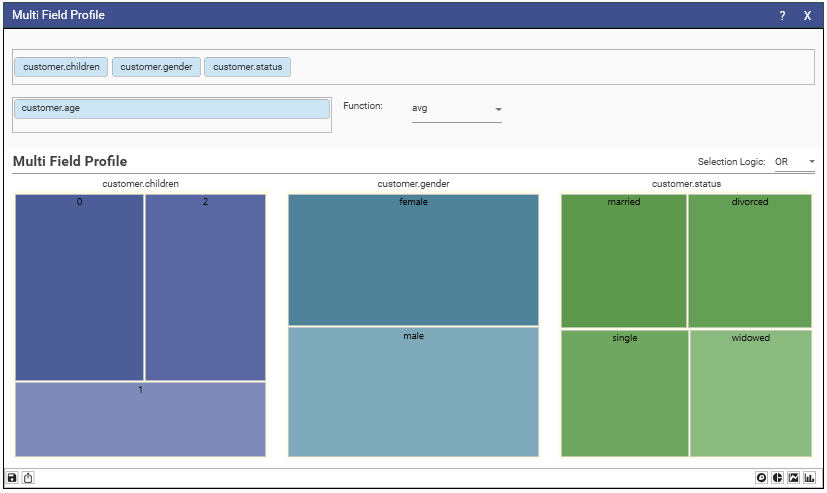
Allow 1 or more fields to be profiled and visualized within the same component.
Drag fields from Solution Explorer into the topmost dimension box.
Each field will be profiles and can displayed as either
- Treemap.
- Pie
- Stacked Bar
- 100% Stacked Bar.
By default, the profile will be simple counts.
Drag a numeric field into the measure box and select a function to perform a function profile.
Selecting
Select a data set from the component by highlighting the segments to be selected,
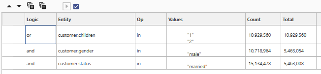
Choose either OR or AND from the Selection Logic combo, then drag from one of the graphs.
If OR is selected then the dataset will be the union of all sub-selections withing each profile's graph.
if AND then it will be the intersection
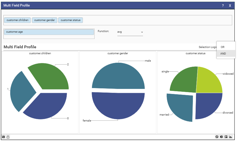
The example above will produce the dataset
Filtering
Drop a filter onto the component to apply a dataset to all the profiles and recalculate.
Right-click one of the graphics either clear the current filter or reset all selections.
Toolbar
The micro-toolbar contains buttons to save the report, export locally to excel and to change graphic display type.
Fine Control
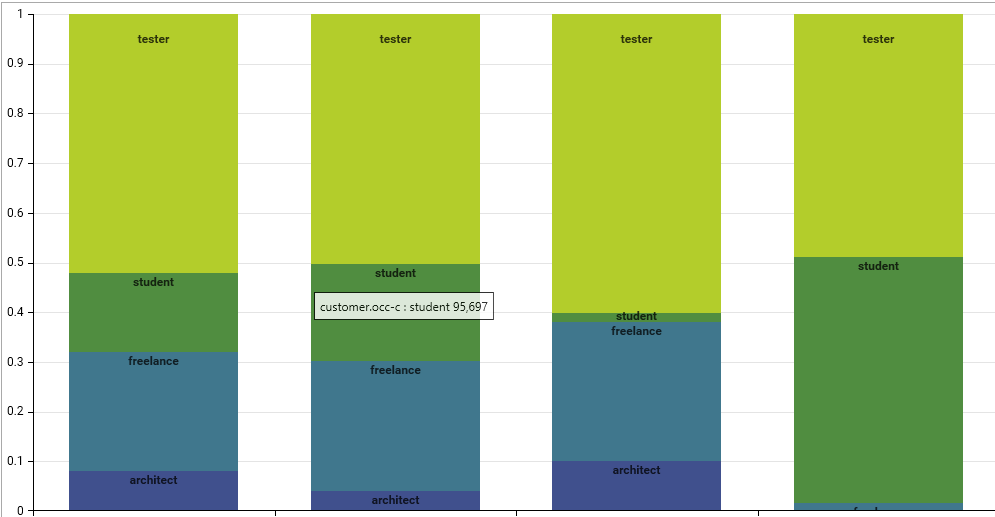
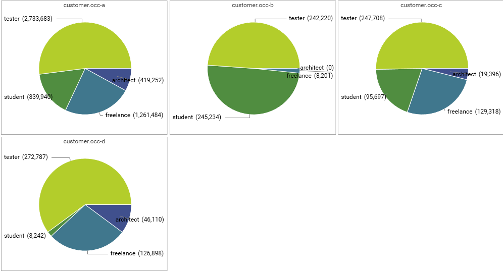
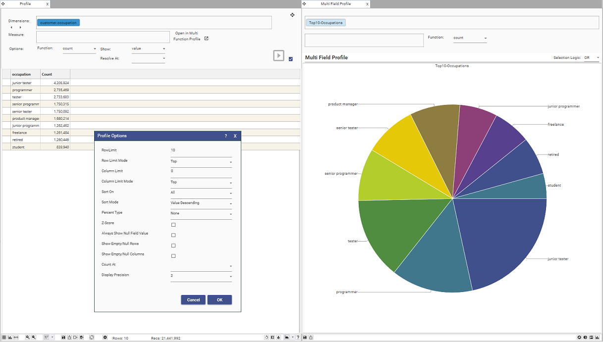
The Multi-Field profile can also accept a profile as a dimension, allowing for finer tuning of what is displayed.
Below, we have created a profile of occupation, sorted by count and selected on the top 10.
This can then be dragged via its tab bar onto the Multi-Field-Profile dimensions box where is it added after having been given name
4.4.29.2
In a Multi Field Profile; if there are a maximum of 2 labels across all the fields they will be considered a collection of binary values and coloring will be identical. e.g. ("0","1")
Tip:
Newly saved Multi Field Reports will have, in their"controlState" entry a maxBinaryColumns key (NB. appears twice per report, change both)
  "controlState": {
    "preferredChart": "Stacked",
    "plotNull": false,
    "maxBinaryColumns": 2
  }
Increase this value, when you know all fields are related, to get identical series colors in bars and pie.
In the following case maxBinaryColumns is set to 4